After several posts of theory, it’s time to build something. In this post, I will walk you through a Visual Designer tutorial to create a complete Contracts dashboard on the M-Files Sample Vault. Therefore, no JSON editing is required at all. The Visual Designer is the primary authoring path for most administrators. Power users who prefer hand-editing JSON can write directly in the JSON editor (toggle to switch in the top bar), but this post focuses on the visual approach where you build dashboards by clicking and filling forms.
I picked the Sample Vault because it is the one that gets shipped when you are installing M-Files in evaluation mode and it contains some sample data, as its name suggests… Please note that since it is a rather old vault, data inside was created somewhere between 2004 and 2012. Therefore, in this blog, I will go back in time (yes, I can!) and consider that “today” is actually the “01-Nov-2011” (2011-11-01). In a real vault, you would use the dateToken “@today” instead, but for this blog, to allow you to reproduce the steps below, I chose that specific date since it gives interesting data to visualize.
1. What I am going to build
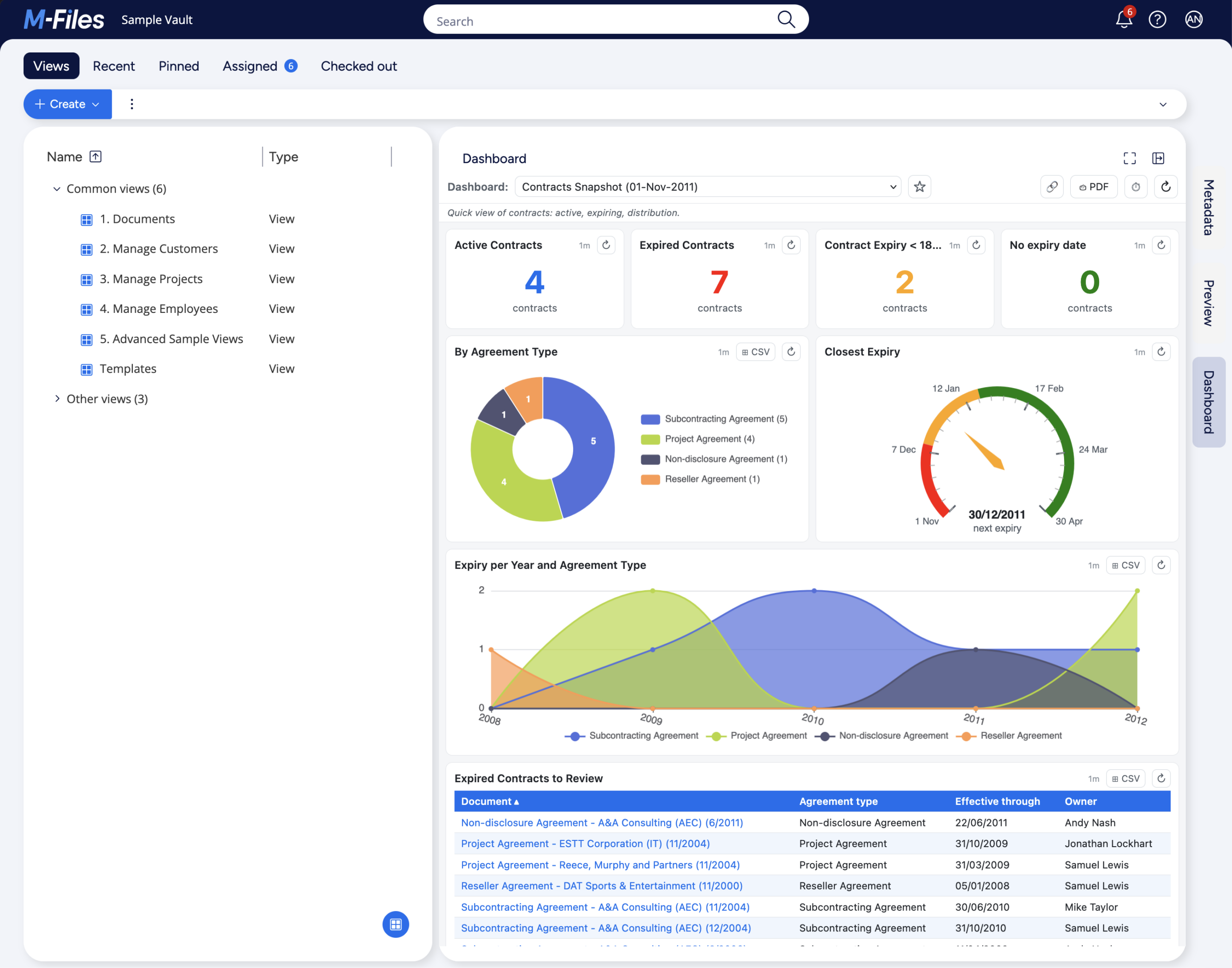
The target dashboard has eight widgets:
- Four KPI tiles in a row at the top: Active Contracts, Expired Contracts, Contract Expiry < 180d, No expiry date.
- One donut: Contracts by agreement type.
- One gauge (date-mode): days until the earliest/next contract expiry.
- One area: contract expiry per year and per agreement type.
- One table: all expired contracts (for review or sales purpose).
This layout fills the right pane with a clean “summary at the top, distribution in the middle, action items at the bottom” reading order.
2. Creating a new dashboard
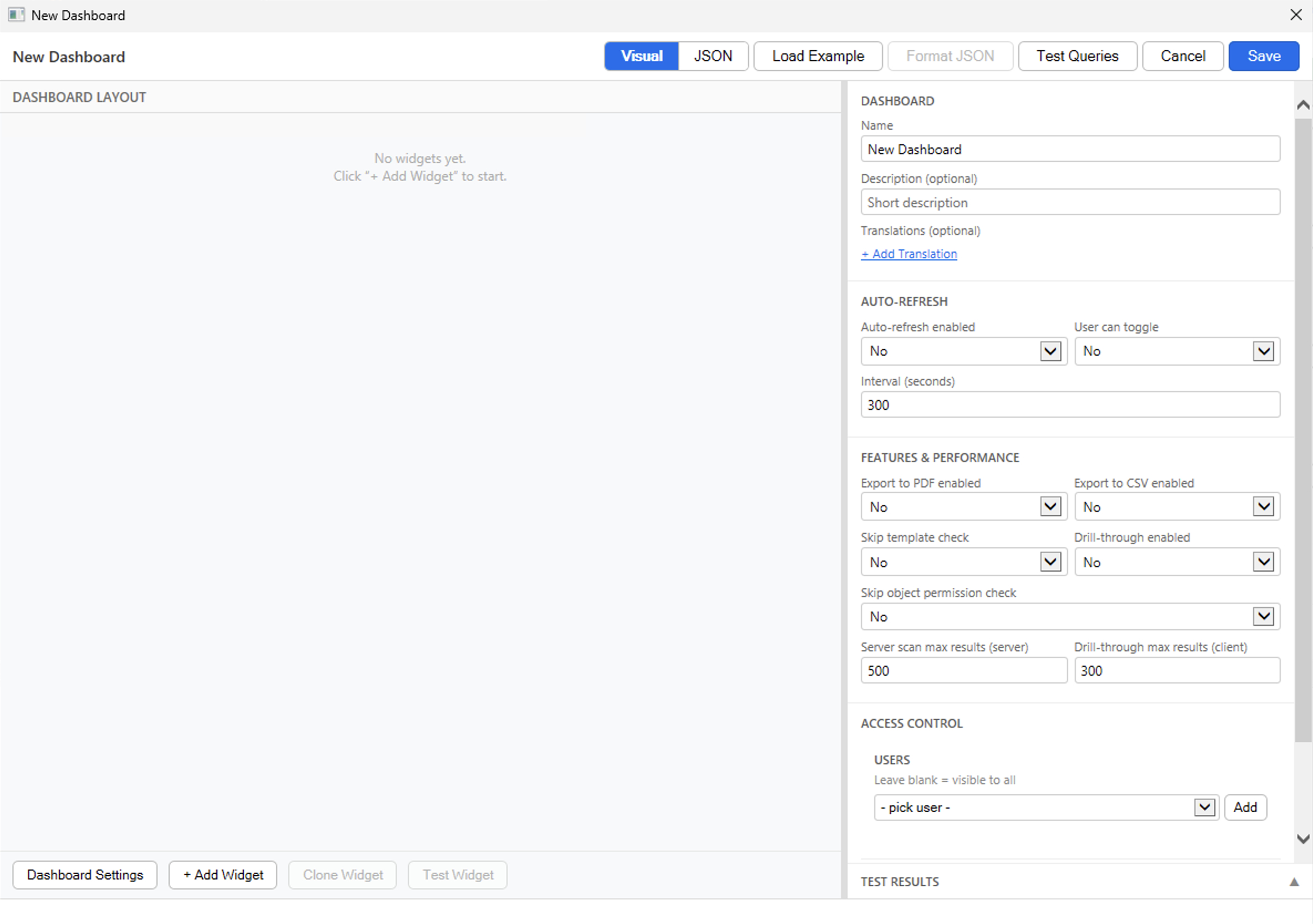
The dashboard management is done on the M-Files Admin UI. To access it, open M-Files Admin -> Configurations -> Other Applications -> dbi services Business Dashboard -> Dashboard tab. Then click on the Add New button. The editor opens, by default in Visual mode with an empty canvas and the Dashboard Settings panel on the right:
3. Dashboard Settings
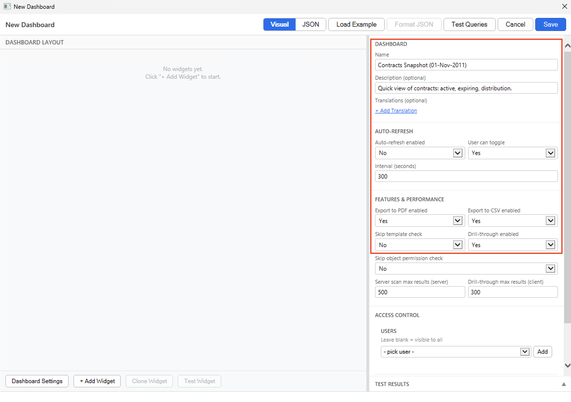
Before adding widgets, let’s configure the dashboard-level fields in the right panel. The below assumes you never updated the default values. If you would like to update the defaults so all future dashboards have your own, you can do it in the Configuration tab.
- Name: Contracts Snapshot (01-Nov-2011).
- Description (optional): Quick view of contracts: active, expiring, distribution..
- Auto-refresh enabled: No (leave off for now, you can flip it on later if needed).
- User can toggle: Yes (users can enable the auto-refresh).
- Export to PDF enabled: Yes.
- Export to CSV enabled: Yes.
- Drill-through enabled: Yes (this is what makes the chart elements clickable and it displays details about the matching objects).
- Leave the rest as default. There are enough query results to fetch all details, each user sees only the objects their M-Files ACL allows, etc.
4. The first KPI tile: Active Contracts
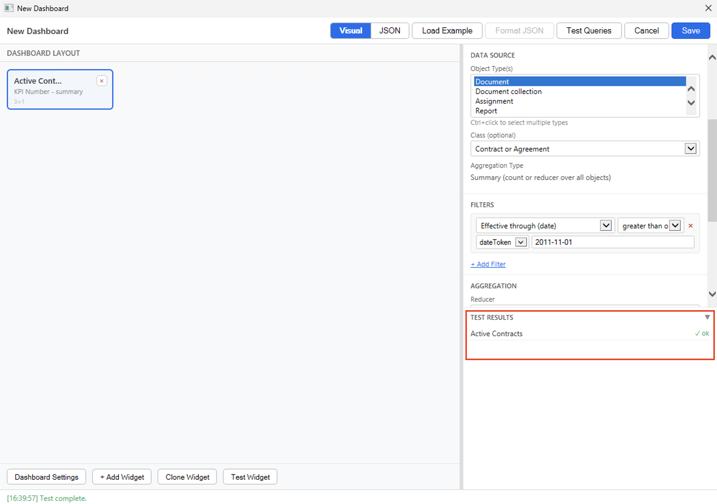
Click on the + Add Widget button in the footer. A blank tile appears on the canvas and the right panel switches to the widget config.
First, we set the widget basic details:
- Widget Title: Active Contracts.
- Description (optional): leave empty.
- Widget Type: KPI Number.
- Col Span: 3.
- Row Span: 1.
Then, we need to configure the source of the data we want to see:
- Object Type(s): Document (dropdown shows the vault’s object types).
- Class (optional): Contract or Agreement (automatically populated after selecting an object type).
- Aggregation Type: summary (already set automatically since it’s the only one supported by kpiNumber).
Optionally, we can configure one or more filters. Here, since we want to see only active contracts (i.e. that have an effective-through date superior or equal to today), then we need to apply a certain filter. Click on the + Add Filter button and a row appears:
- Property: Effective through (date) (from the property dropdown, the “(date)” is the data-type that is shown but it’s not part of the property name).
- Operator: greater than or equal (>=).
- Value type: dateToken.
- Value: 2011-11-01 (instead of “@today” in a real vault).
Finally, we define the aggregation (i.e. what to do with the results obtained) as well as the display section, which are optional graphical/rendering details:
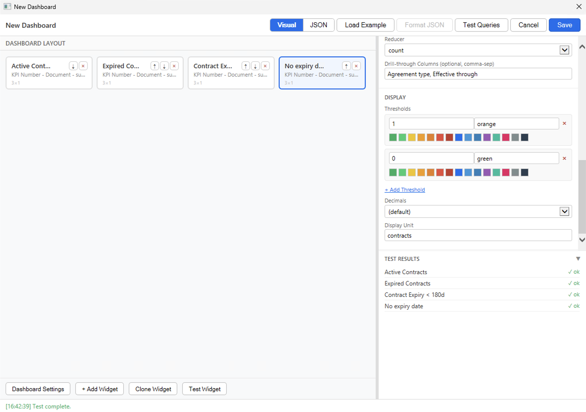
- Reducer: count (default).
- Drill-through Columns (comma-sep): Agreement type, Effective through (the additional columns to add to table lists or drill-through details tables).
- Display Unit: contracts.
To validate that the configuration is correct, you can click on the Test Widget button in the footer. The Test Results panel expands on the right side, and shows a green OK, which confirms the definition is correct. So far, so good.
5. The other three KPI tiles
The next three KPIs follow the same pattern as the first one, with different filters.
5.1. Expired Contracts
With the 1st widget selected, click on the Clone Widget button. A new tile appears next to the first one, with exactly the same content. Simply update these fields:
- Widget Title: Expired Contracts.
- Operator (Filter): less than (<).
Click on the + Add Threshold button and a row appears:
- Value (Threshold): 1 (any value equal or above 1 will match).
- Color (Threshold): red or #e74c3c (color used if above value is reached).
5.2. Expiring in next 180 days
Click on the Clone Widget button again:
- Widget Title: Contract Expiry < 180d.
- Operator (Filter): between (from,to)
- Value (Filter): 2011-11-01, 2011-11-01+180d (instead of “@today, @today+180d” in a real vault).
- Color (Threshold): orange or #f39c12 (update the existing threshold and keep the value as 1).
5.3. No expiry date
Click on the Clone Widget button again:
- Widget Title: No expiry date.
- Operator (Filter): is empty (incl. absent) (no value field for this operator).
Click on the + Add Threshold button and a second row appears (keep the other one with 1-orange):
- Value (Threshold): 0 (any value equal or above 0 but below 1 (c.f. other threshold) will match. i.e. only valid if equal to 0).
- Color (Threshold): green or #27ae60 (color used if above value is reached).
At this point the canvas shows four KPI tiles. They each have colSpan: 3, so they sit nicely in a row of four totalling 12 (full width of the dashboard). You can click on Test Queries button (at the top) to validate that all four kpiNumber widgets are correct.
6. The donut: contracts by agreement type
Click on the + Add Widget button in the footer to add a new widget:
- Widget Title: By Agreement Type.
- Widget Type: Donut Chart.
- Col Span: 6.
- Row Span: 2 (chart widgets need height, see Post 3).
- Object Type(s): Document.
- Class (optional): Contract or Agreement.
- Aggregation Type: Group by Property (all objects with the same value of a specific property will be grouped together).
- Group-by Property: Agreement type (lookup) (the property to be used for the grouping).
- Drill-through Columns (comma-sep): Agreement type, Effective through.
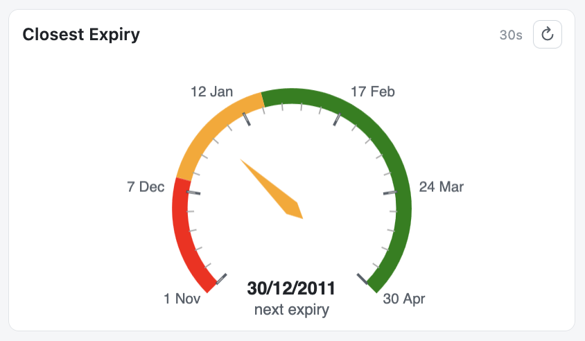
7. The date-mode gauge: countdown to next expiry
The gauge is where things get more interesting. Here, I would like a dial showing how many days are left until the earliest/next contract expiry. This can be useful for making sure you never reach “0” (i.e. the date of today) on some tasks, like contracts renewal, period reviews of some documents, etc. You can see this as something similar to a fuel gauge in a car. If it reaches the minimum, you might be in trouble… The reducer is min on the Effective through property, and since this property is a date, it triggers date-mode automatically.
Add the sixth widget. You know the drill, + Add Widget:
- Widget Title: Closest Expiry.
- Widget Type: Gauge.
- Col Span: 6.
- Row Span: 2.
- Object Type(s): Document.
- Class (optional): Contract or Agreement.
Let’s add a filter to keep only valid contracts again: click on the + Add Filter button and a row appears:
- Property: Effective through (date).
- Operator: greater than or equal (>=).
- Value type: dateToken.
- Value: 2011-11-01 (instead of “@today” in a real vault).
- Reducer: min.
- Reducer Property: Effective through (date).
- Drill-through Columns (comma-sep): Agreement type, Effective through.
Now let’s add a first threshold: click on the + Add Threshold button and a row appears:
- Value (Threshold): 0 (so “today” = the contract expiry is very soon).
- Color (Threshold): red or #e74c3c.
Click on the + Add Threshold button and a second row appears:
- Value (Threshold): 40 (so “next month” = the contract expiry is coming).
- Color (Threshold): orange or #f39c12.
Click on the + Add Threshold button and a third row appears:
- Value (Threshold): 80 (so at least “2 months left” = the contract expiry is still far).
- Color (Threshold): green or #27ae60.
- Display Min (day offset): 0 (so “today”).
- Display Max (day offset): 180 (so “today” + 180 days).
- Display Unit: next expiry.
7.1. Sample Vault date limitation
Note: This widget will not fully work on the Sample Vault as-is, since the data is from 2011 and all contracts are already in the past. In a real vault, you would use @today as the filter value and set min/max to 0 and 180. The gauge would then show the number of days until the earliest active contract expires.
On the Sample Vault, since 01-Nov-2011 is roughly 5350 days in the past, you would need to set min to “-5350” and max to “-5350+180” to see a meaningful result. The exact offset depends on when you read this, which is precisely why date tokens like @today exist – they adapt automatically.
If I set the min/max offset to the accurate number of days since 01-Nov-2011, the gauge looks like this for end-users (that’s what It will look like on a real vault with @today and 0-180 values):
8. The area chart: expiry per year and per agreement type
Add the seventh widget. It didn’t change since earlier, it’s still + Add Widget…
- Widget Title: Expiry per Year and Agreement Type.
- Widget Type: Area Chart.
- Col Span: 12.
- Row Span: 2.
- Object Type(s): Document.
- Class (optional): Contract or Agreement.
- Aggregation Type: Group by Date Bucket (all objects with the same date bucket for a specific property will be grouped together).
- Date Property: Effective through (date) (the property to be used for the grouping).
- Bucket Size: year (the objects within the same year will be in the same group).
- Series Property (optional): Agreement type (lookup) (a second grouping level).
- Drill-through Columns (comma-sep): Agreement type, Effective through.
- Smooth Lines: Yes.
Note: Instead of an Area Chart, you can use a Line Chart or Bar Chart, these three are usually interchangeable and can give the same amount of information visually.
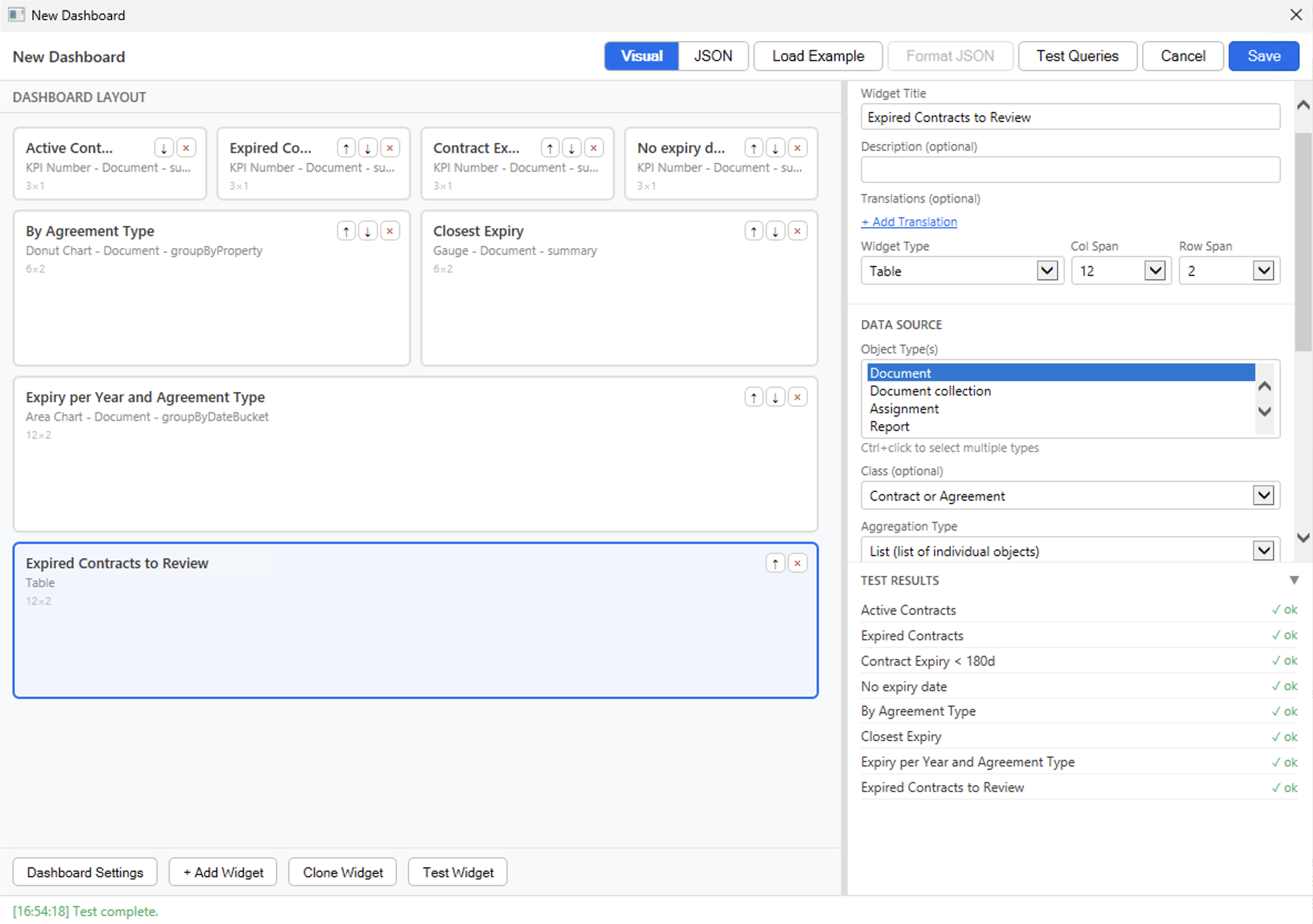
9. The table: expired contracts to review
The last widget is a table showing the list of all expired contracts. This can be used for review or for some sales purpose, as previously mentioned. So let’s + Add Widget one last time:
- Widget Title: Expired Contracts to Review.
- Widget Type: Table.
- Col Span: 12.
- Row Span: 2 (you can set 3 as well, for bigger table/lists).
- Object Type(s): Document.
- Class (optional): Contract or Agreement.
- Aggregation Type: List (list of individual objects).
Click on the + Add Filter button and a row appears:
- Property: Effective through (date).
- Operator: less than (<).
- Value type: dateToken.
- Value: 2011-11-01 (instead of “@today” in a real vault).
- Display Properties (comma-sep): Agreement type, Effective through, Owner.
10. Sanity check & Saving
Before saving, you can click on the Test Queries button from the toolbar to validate all widgets at once. The right-panel should list eight widgets, all green and without any warnings or errors. If something is wrong – a property name typo, an incompatible reducer / widget combination – this is where it would surface, with a clean message describing what to fix.
If it’s all green, then click on the Save button in the toolbar. The editor should display a message at the bottom saying it validated everything and then closes (you need to be quick to see the message). The Admin UI Dashboard tab refreshes, and the Contracts Snapshot dashboard now appears in the list, with its number of widgets and its description.
Now, let’s see what it looks like from an end-user perspective after all that work! You can open the M-Files Web or Desktop (or do a refresh CTRL+F5 / CMD+R if it’s already loaded), open the right pane by clicking on the Dashboard tab, and pick Contracts Snapshot from the dropdown (it should be displayed automatically if it’s your first dashboard). Every chart element should be clickable (drill-through is enabled), and the PDF / CSV export buttons should also be present.
See the first screenshot at the beginning of this blog post to see the final result that you can expect if you followed along the steps so far. Still, since you made it this far, here is what it looks like as a PDF Export:
11. Closing thoughts
I initially created the Business Dashboard with the JSON editor only, but I always had in mind that I needed to add a Visual Designer at some point, because not everybody knows how (or wants) to write JSON. Also, writing JSON directly requires you to know what is required, optional, supported or not supported. Even if the Test Queries and Save buttons both execute multiple layers of validations, to ensure everything you enter is supported, it still sends you warning after warning, error after error if you do not really know what you are doing. Therefore, the Visual Designer is great for that purpose, because you just click-through the details and you are guided all the way.
The Visual / JSON toggle at the top of the editor lets you switch between authoring paths at any time, and your work is preserved in both directions. If you prefer hand-editing JSON or need to do bulk changes, the JSON mode is always available—but most administrators find the Visual Designer sufficient for their day-to-day work.
Want to know more about this Business Dashboard? Contact us and we will be happy to showcase it on M-Files.
Quick access to previous blog posts of the series:
- Post 1 – Introduction to the Business Dashboard.
- Post 2 – The end-user experience: opening the panel, switching dashboards, drill-through, exports, favorites, sharing.
- Post 3 – The anatomy of a dashboard definition: the JSON structure that drives everything.
- Posts 4a, 4b, 4c – The widget catalog, split by type family: scalar widgets (kpiNumber, gauge), trend widgets (line, area), and distribution / tabular widgets (donut, bar, table).
- Post 5 – Writing queries: objectType, class, filters, date tokens.
- Post 6 – Aggregations and reducers.
- Post 7 – The Admin tab: actions, Visual Designer / JSON editor, validation, import / export, access control.
![Thumbnail [60x60]](https://www.dbi-services.com/blog/wp-content/uploads/2022/08/MOP_web-min-scaled.jpg)
![Thumbnail [90x90]](https://www.dbi-services.com/blog/wp-content/uploads/2022/08/GME_web-min-scaled.jpg)
![Thumbnail [90x90]](https://www.dbi-services.com/blog/wp-content/uploads/2022/08/ATR_web-min-scaled.jpg)