Over the past few weeks, I’ve addressed philosophical questions related to enterprise content management (ECM), such as “What should be done?” and “Why?” Now, it’s time to focus on the “how.”
When discussing user adoption of M-Files, the conversation often centers on training, change management, and automation. While these aspects are important, another factor immediately impacts the user experience: the Metadata Card.
A poorly designed Metadata Card can overwhelm users with unnecessary fields and irrelevant questions, making creating a document feel like filling out a tax form. Conversely, a well-designed Metadata Card naturally guides users through the process by displaying only the necessary information.

The goal is not to collect as much metadata as possible but rather to collect the right metadata at the right time.
Just a reminder that in M-Files, a metadata card is the panel that displays and allows users to edit the metadata properties of an object. It is an essential component of the tool.
Start with the user journey
Before creating properties or configuring rules, ask a simple question:
What information does the user actually know at this stage?
Consider an invoice.
At creation, the user probably knows:
- Supplier
- Invoice number
- Invoice date
- Amount
They probably don’t know:
- Approval status
- Payment date
- Accounting reference
- Archive classification
Those properties should appear only when they become relevant.
Metadata Card should evolve with the document lifecycle rather than exposing every possible property from the beginning.
Hide what isn’t needed
One of the most effective improvements is dynamic property visibility.
Rather than displaying every property permanently, configure the card so that properties only appear when certain conditions are met.
For example:
- If the document class is “Contract”, display the contract expiration date.
- If the supplier is external, display vendor-specific properties.
- If the document is confidential, display the security classification section.
- If the document enters the approval workflow, display approval-related properties.
This approach reduces visual clutter and helps users focus on the task at hand.
Make properties mandatory only when necessary
One common mistake is making too many properties mandatory.
Although mandatory properties can be useful, they should only be used when appropriate.
For example:
The “termination date” property should not be mandatory when creating a new employee contract. This property only becomes relevant if the employee leaves the company.
Conditional mandatory properties allow for validation without frustrating users.
Rather than forcing users to enter placeholder values just to save the document, only ask for this information when it is required by the business process.
Group related information
Metadata cards are easier to navigate when related properties are grouped together.
Instead of a long list of unrelated fields, organize them into logical sections.
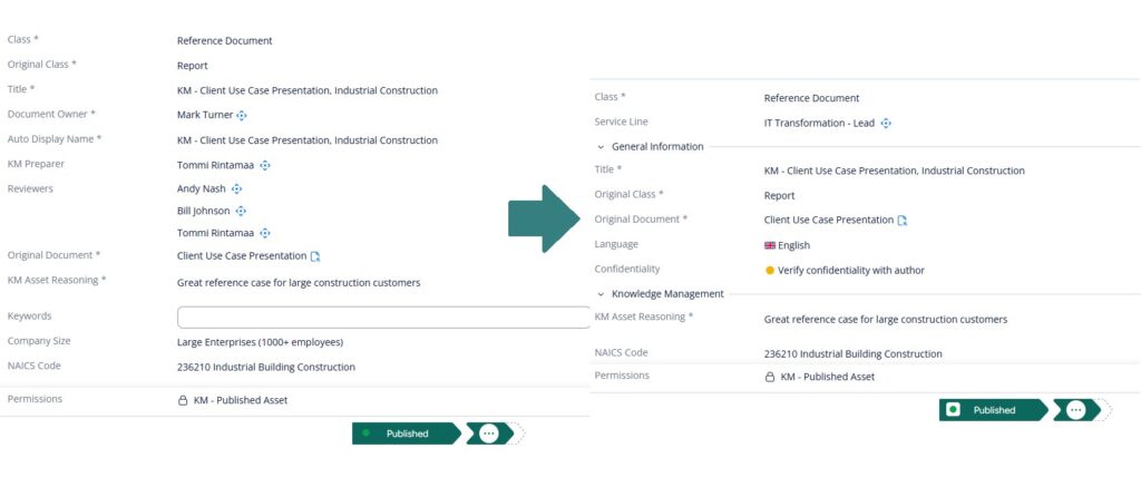
Users scan information much faster when it is visually organized.
Additionally, sections that are not needed at a given stage can be hidden or collapsed.
Reduce decisions
Every visible property asks the user to make a decision.
Should I fill this in?
Does this apply to my document?
What does this property even mean?
A good metadata card minimizes these decisions.
It is good practice to use:
- Automatic values
- Default values
- Value lists
- Metadata inheritance
- Calculated properties
The fewer decisions users have to make, the faster and more accurately they can classify documents.
Avoid the “Everything might be useful”
One of the biggest design mistakes is trying to satisfy every department.
For instance, the Human Resources department requires three properties, the Legal department requests five more, the Finance department submits a request for four additional fields, and finally, the Compliance department adds another six.
After a few workshops, the metadata card ends up with thirty or forty properties.
Technically, everything is possible.
Practically, nobody enjoys using it.
Whenever a new property is requested, ask:
- Who will maintain it?
- Who actually uses it?
- What business process depends on it?
- What happens if it remains empty?
If there isn’t a clear answer, then the property probably isn’t necessary.
Design for the common case
Most users perform the same actions repeatedly.
Optimize the metadata card for 80% of documents rather than exceptional cases.
Advanced scenarios can reveal additional properties as needed.
Simple cases should remain simple.
Think like a product designer
Administrators often focus on configuration, whereas it is the users who interact with the interface.
Therefore, it is important to keep in mind that every additional property increases cognitive load.
Similarly, every unnecessary required field creates friction.
Conversely, every hidden property reduces complexity.
A well-designed metadata card improves not only data quality but also the user experience of the entire M-Files system.
Conclusion
Metadata is one of M-Files’ greatest strengths, but only if users provide it.
The best metadata card isn’t the one that captures the most information.
Rather, it’s the one that asks the fewest questions while still collecting everything the business needs.
When users feel that the system understands their tasks instead of getting in their way, they will naturally adopt it.
Sometimes improving user satisfaction isn’t about adding new functionality; it’s about designing a better metadata card.
Whether you’re planning a new M-Files implementation or looking to improve an existing one, we can help you design a solution that is efficient, user-friendly, and aligned with your business needs. Feel free to contact us to discuss your project.
![Thumbnail [60x60]](https://www.dbi-services.com/blog/wp-content/uploads/2022/08/GME_web-min-scaled.jpg)
