This is the second widget post of the series, focused on the two trend widgets: line and area. The previous one covered scalar widgets (Post 4a). Since these two widgets are closely related, it made sense to bundle them together in the same post. Both surface a single value per category or per time bucket, plotted across a horizontal axis. They are best used with the groupByDateBucket aggregation to show evolution over time, but they also accept groupByProperty and groupByRange.
1. Why these two are in the same post
The wire format and the rendering pipeline for line and area are nearly identical. They produce the same JSON on the server, they use the same client code path, they accept the same aggregation types, the same reducers, the same display options. The only meaningful difference is visual: area fills the region under the line with a translucent color, while line leaves it transparent.
In other words: choose area when you want to emphasize cumulative volume or magnitude, choose line when you want to emphasize the trajectory. Both communicate the same thing, it’s more about what you want to focus on.
2. A first example: monthly revenue trend
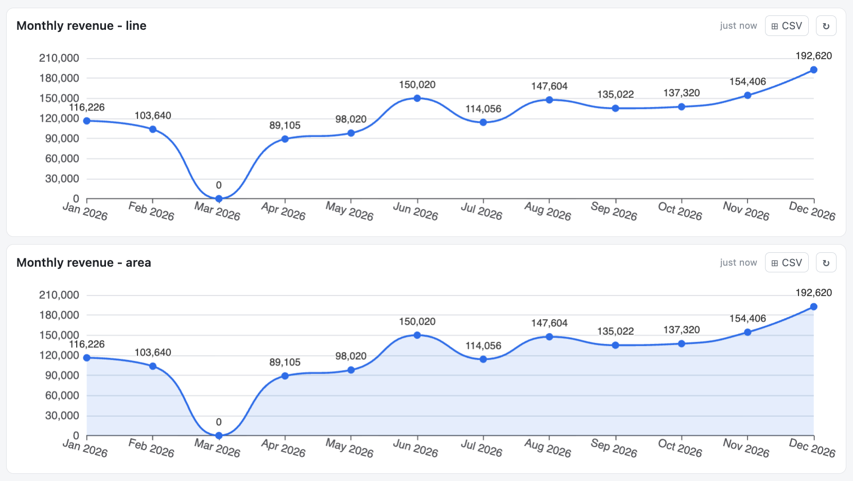
Here is the canonical example: total invoice amount per month for the ongoing year, displayed as a line chart.
{
  "id": "",
  "title": "Monthly revenue",
  "type": "line",
  "gridColumnSpan": 12,
  "gridRowSpan": 2,
  "display": { "smooth": "Yes", "decimals": 0 },
  "query": {
    "objectType": "Document",
    "class": "Invoice",
    "filters": [
      { "property": "Invoice date", "operator": "between",
        "value": ["@startOfYear", "@endOfYear"], "valueType": "dateToken" }
    ],
    "aggregation": {
      "type": "groupByDateBucket",
      "propertyName": "Invoice date",
      "bucketSize": "month",
      "reducer": "sum",
      "reducerProperty": "Amount",
      "includeEmptyResults": "Yes"
    }
  }
}
A few things to note in this JSON:
- The filter restricts the data to the current calendar year using two date tokens. The full date-token vocabulary is covered in the future Post 5.
- The aggregation is groupByDateBucket on the same date property, bucketed by month. Each bucket is reduced with sum of the Amount property. In other words, this means that all invoices with a date within this calendar year will be grouped by month and the value coming from the Amount property will all be summed within each month to arrive to a Total per month.
- includeEmptyResults: “Yes” ensures that months with no invoices appear as zero values, so the trend line is continuous from January to December rather than skipping empty months (e.g. you were closed for vacations or weren’t able to sell anything for some other reasons).
Switching the widget type from line to area in this exact JSON gives the area-chart variant, nothing else changes:
3. The aggregation types these widgets accept
line and area are valid with three aggregation types:
- groupByDateBucket: the natural fit for time series. It groups a date / timestamp property into a certain bucket: day, week, month, quarter, or year.
- groupByProperty: groups by the distinct values of any property. It supports date/time properties, but it’s uncommon, as each day would be a data-point. It also support any other type of properties, to display them as categorical trends (e.g. “Monthly revenue per region” rendered as a line for some reason). Depending on requirements, a bar display might be more adapted.
- groupByRange: define manual ranges of something (string or number) and turn them into points to plot (e.g. Revenue <1k, <10k, <50k, <100k, >=100k)
The visual designer will only allow you to select one of these three aggregations. But if you try to set a summary or list aggregation in the JSON editor directly, then an error will be thrown, as it isn’t possible.
4. display.smooth
The single most common display option for these widgets is smooth:
"display": { "smooth": "Yes" }
When set to “Yes”, the line/area charts draws a Bézier-smoothed curve between data points (c.f. example above). When “No” (or omitted), the connecting line is made of straight segments. Smoothing makes monthly or quarterly trends look more visually pleasant. It can also slightly hide outliers, so use it where the trend story is more important than the exact per-bucket value.
5. display.decimals
For numeric reducers (sum, avg, min, max, median), this controls how many decimal places are shown in tooltips (default 0).
"display": { "smooth": "Yes", "decimals": 2 }
In the monthly-revenue example above, if amounts are stored as floats (which is probably the case), you may want decimals: 2 so the tooltip would show 116’520.43 rather than 116’520.
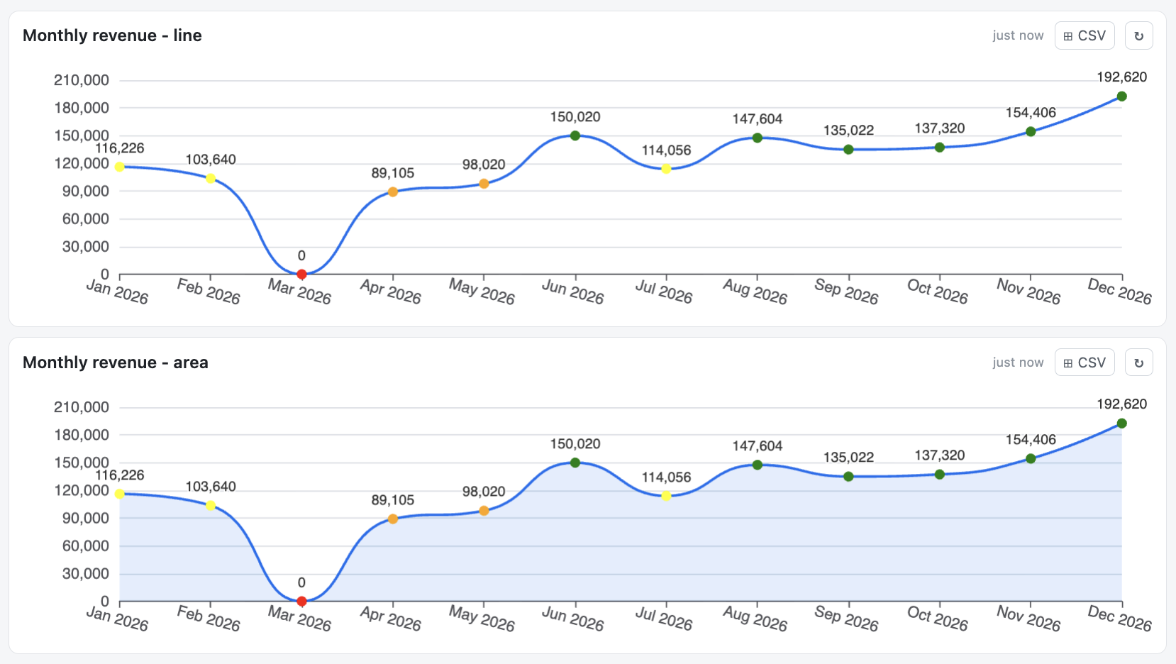
6. display.thresholds in single-series mode
In single-series mode (no seriesProperty), the thresholds array colors each data point marker based on its own value. The connecting line (and the area below) itself stays brand blue. The configuration is the same as on kpiNumber and gauge. You can either use text values representing colors or the HTML color code:
"display": {
  "smooth": "Yes",
  "thresholds": [
    { "value": 0, "color": "red" },
    { "value": 40000, "color": "orange" },
    { "value": 100000, "color": "yellow" },
    { "value": 120000, "color": "green" }
  ]
}
This is useful to highlight specific buckets that crossed a business threshold without changing the overall trend visualization. As mentioned in Post 4a, the default falls back to brand blue for values below the lowest threshold.
7. seriesProperty: multiple lines on the same chart
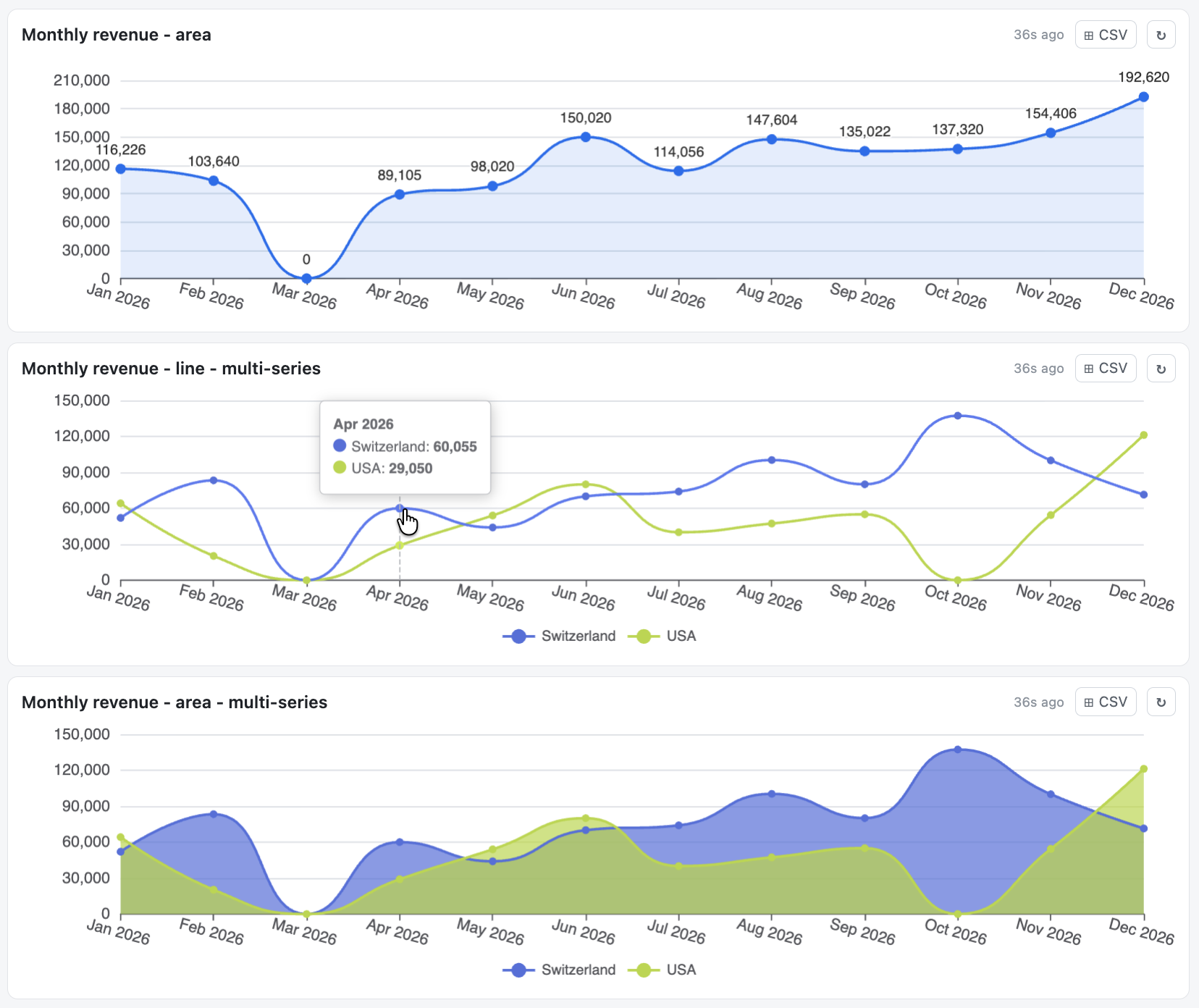
This is where these widgets become genuinely powerful. When you set a seriesProperty on the aggregation, the engine produces one line per distinct value of that additional property, with an automatic legend and color palette.
For instance, splitting the monthly revenue line into separate lines per country:
"aggregation": {
  "type": "groupByDateBucket",
  "propertyName": "Invoice date",
  "bucketSize": "month",
  "reducer": "sum",
  "reducerProperty": "Amount",
  "seriesProperty": "Country",
  "includeEmptyResults": "Yes"
}
A few notes that matter in practice:
- display.smooth applies to every series. There is no per-series smoothing.
- display.thresholds are silently ignored in multi-series mode. If they were applied per-point, they would override the series palette colors and break the relationship between line color and legend label. So the engine drops them in multi-series and keeps the legend honest.
- includeEmptyResults in multi-series mode fills gaps across both dimensions (every series gets a zero in any time bucket where it has no data). This avoids broken lines.
7.1. Use low-cardinality series only
The seriesProperty is best used with low-cardinality properties: lookup values, booleans, short text ranges. A monthly revenue chart with 5-6 customers is readable, but the same chart with two hundred customers becomes a colored mess where no individual line is distinguishable from the others. If there are too many series, it loses its usefulness. The validation wouldn’t block it though, since it is technically a valid compatibility. Try it, and see what it looks like!
8. includeEmptyResults: gap filling
I mentioned this earlier already, and as you could see above, there are actually months with “0” values/amounts.
With includeEmptyResults: “Yes” present, the graph will fill the gaps between the earliest and the latest data points found with zero values. In above example, we can see in March that there was 0 revenue in total. And similarly, in October, there was 0 revenue for the USA. There is no discontinuity in the lines, all months are present, even if there is “0” as a result.
With includeEmptyResults: “No”, the chart will only display the buckets that have at least one matching object (across the series). So, if no invoice was issued in March, the X axis jumps from February to April directly. For above case, it would still display October, since there is a revenue in Switzerland, therefore the USA line will display a “0” value still, the line cannot be “cut”. Visually, that compresses the time scale and hides the meaningful “we had no revenue in March” signal.
There are valid use cases for both situations, so just select the one that makes sense depending on what you want to see.
Note: Adding includeEmptyResults: “Yes” can also add a (none) bucket for objects whose property used by the groupByProperty has no value. For example, if you group by a boolean state Yes/No, and some objects do not have a value on that boolean, they would end up in this (none) group. For groupByDateBucket or groupByRange, they usually appear less frequently since you are grouping things on a certain range, but in the end, it also behaves in the same way if it does happen.
9. The “no date-valued reducer” rule
Same rule as on chart widgets in general: line and area cannot render a reducer that returns a date string. If you write something like:
"aggregation": {
  "type": "groupByProperty",
  "propertyName": "Customer",
  "reducer": "max",
  "reducerProperty": "Invoice date"
}
Then, with a line widget, the display would contain a placeholder and the query validation would show a warning. The reason was discussed in the previous post: ISO dates cannot be plotted on a numeric axis at the moment, so it wouldn’t make sense as a display.
The workaround is the same: use kpiNumber or a gauge in date mode if you only want to display one value, or a table for one or more values.
10. Drill-through on trend widgets
When drillThroughEnabled is “Yes”, clicking a data point opens the drill-through modal with the objects in that bucket. In multi-series mode, the click respects the series the point belongs to: only objects matching both the time bucket and the series value are shown. This makes it easy to answer questions like “show me the May invoices from Switzerland” with a single click on the right point of the line.
11. Wrap-up
line and area are the natural choice for time-series questions. They are fundamentally one widget with two visual modes, sharing the same aggregation contract and the same display vocabulary. The interesting part is what you can do with seriesProperty: turning a single trend into a multi-actor comparison without writing any extra logic.
Post 4c picks up the remaining three widgets: donut, bar, and table. The grouping rationale will be that they all answer distribution questions (how a population breaks down by category) or tabular questions (give me the raw rows), as opposed to the time-trend questions that line and area handle.
Want to know more about this Business Dashboard? Contact us and we will be happy to showcase it on M-Files.
![Thumbnail [60x60]](https://www.dbi-services.com/blog/wp-content/uploads/2022/08/MOP_web-min-scaled.jpg)
![Thumbnail [90x90]](https://www.dbi-services.com/blog/wp-content/uploads/2022/08/GME_web-min-scaled.jpg)
![Thumbnail [90x90]](https://www.dbi-services.com/blog/wp-content/uploads/2022/08/ATR_web-min-scaled.jpg)