Power BI 5 top custom visuals
The development of Power BI itself is fast. But, the means to represent data is too. I mean there are constantly new Power BI custom visuals developed by the community and Microsoft.
You can develop your own custom visuals and publish them on the marketplace for your organization or the whole community.
Tips : check if the visuals are certified, meaning they have been tested on the different Power BI possibilities
You can find the gallery of custom visuals here: https://Appsource.microsoft.com/en-us/marketplace
Here are 5 different ones presented during the PASS Summit session:
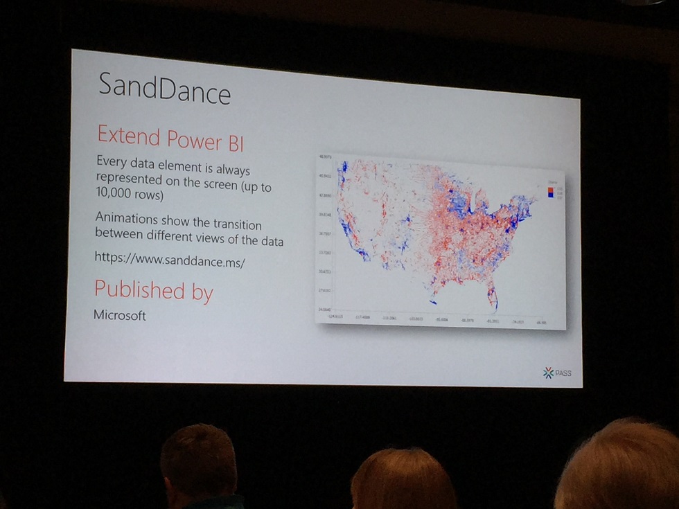
1- SandDance
Used to display every data element of your data set on XY axis. It enables also to zoom in the data to isolate a plotted area and create scenes to show your data with animations.
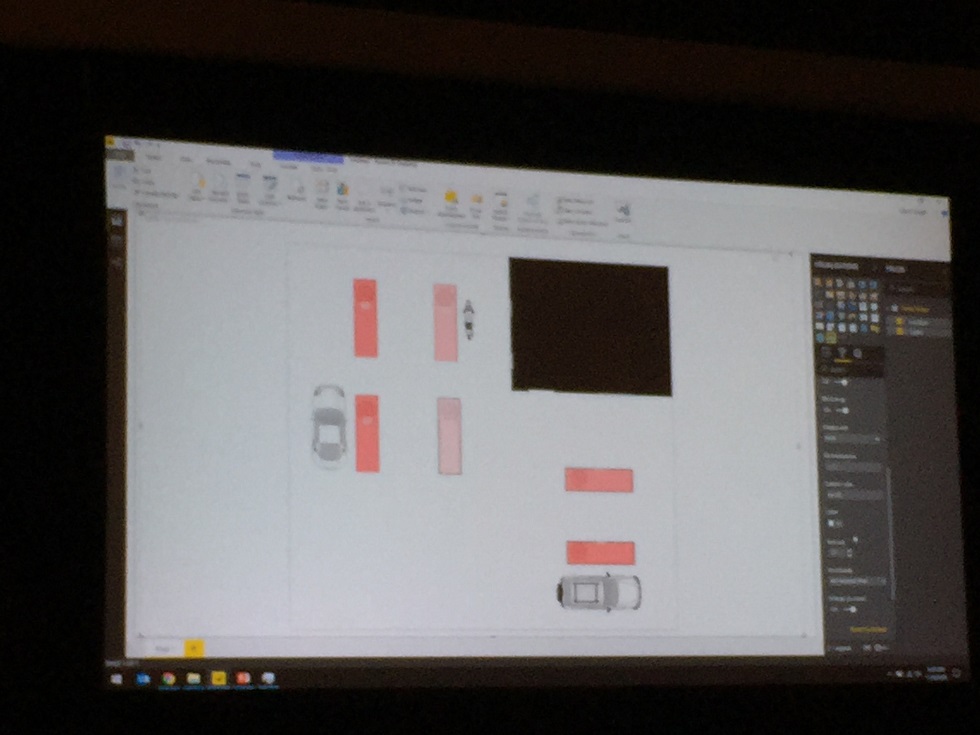
2- Synoptic Panel
Connects areas in a custom image with attributes in your data model using a designer
Https://Synoptic.design in order areas in your image that you will map to your data set
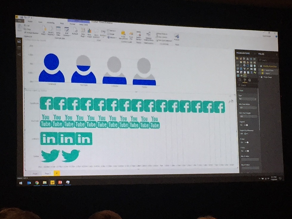
3- Infographic designer
Custom the representation of you data to your specific need or business even with your own images
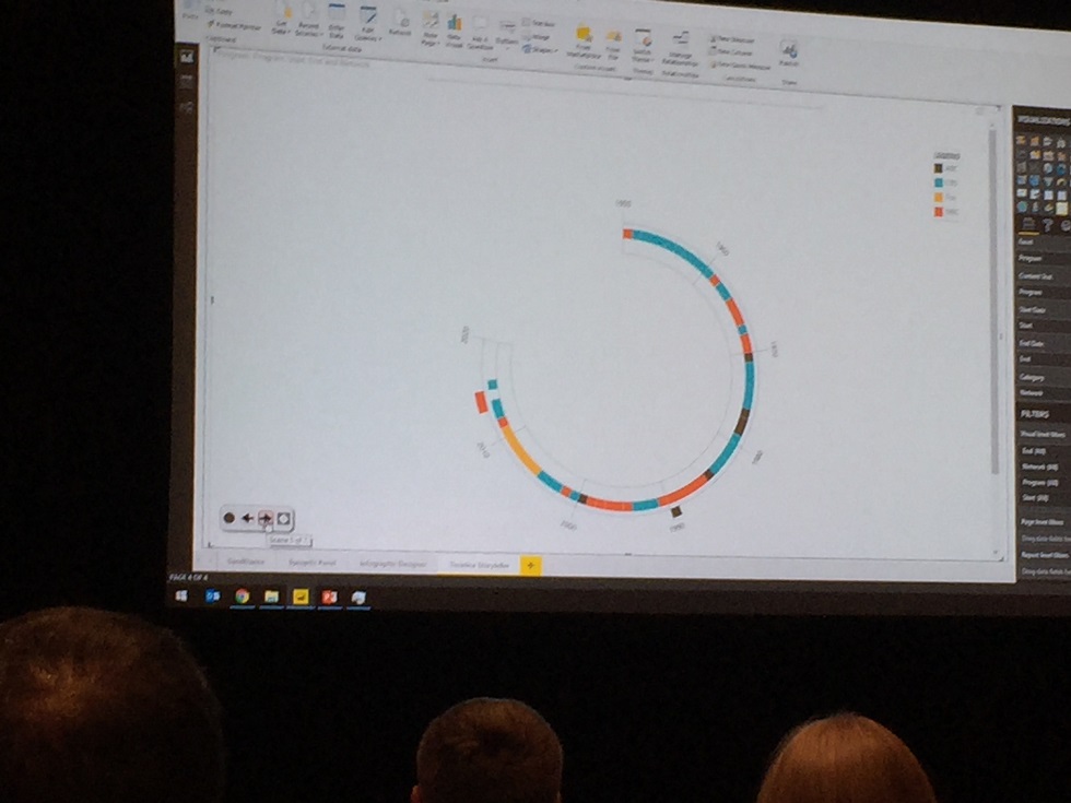
4- Timeline Storyteller
Multiple representation and layouts of data based on time axis you can organize in order to tell a story with your data
5- PowerApps
Integrate Line of Busienss application into Power BI. This can be used as well to have Writebacks in Power BI.
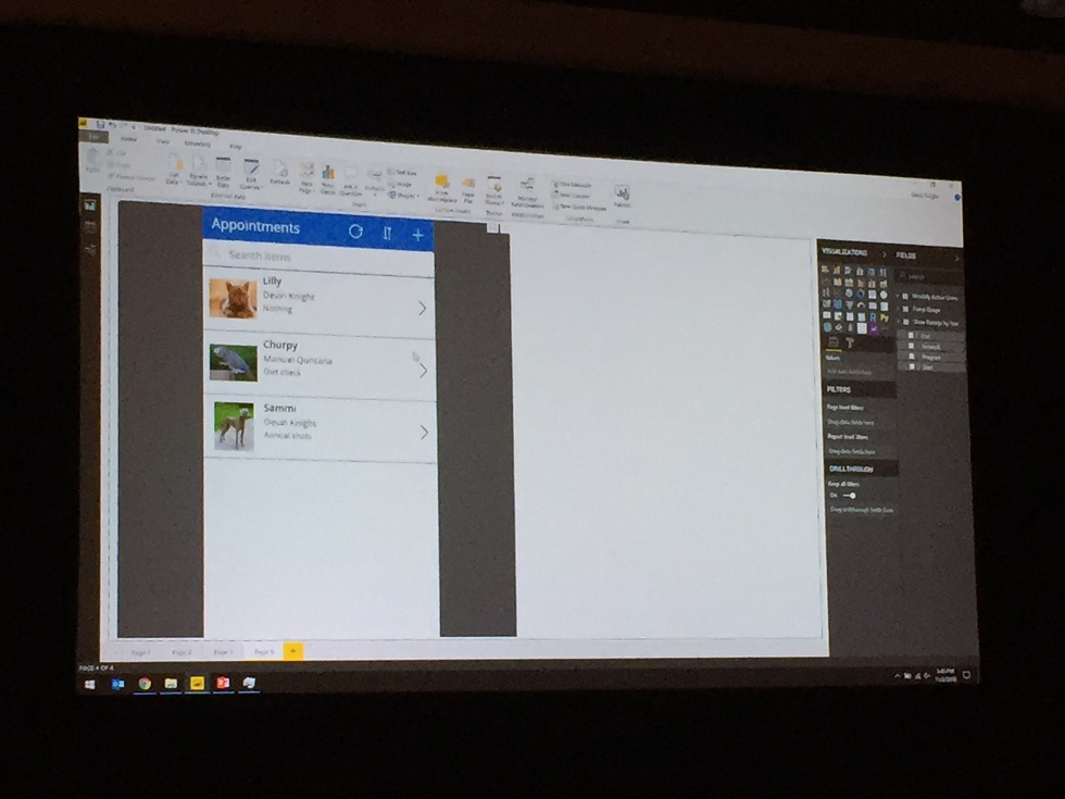
Development of your power App must be done in the website Https://Powerapps.com if you are integrate it using Power BI Desktop. You will have a difference of experience using the service version. In the service version including the PowerApps visual will allow you to create the powerapps automatically with the fields of your data set
Again an interesting data analytic day…stay tuned..
![Thumbnail [60x60]](https://www.dbi-services.com/blog/wp-content/uploads/2022/09/CHC_web-min-min-scaled.jpg)
![Thumbnail [90x90]](https://www.dbi-services.com/blog/wp-content/uploads/2022/08/GME_web-min-scaled.jpg)
![Thumbnail [90x90]](https://www.dbi-services.com/blog/wp-content/uploads/2022/08/ATR_web-min-scaled.jpg)