This is the first widget-specific post of the series. As a reminder, the previous post mapped the anatomy of a dashboard definition. From here on, I go widget by widget. I have grouped the seven widget types into three families:
- Scalar widgets: kpiNumber and gauge both display a single value (a count, a sum, a date) over the matching object set. This is what the current post covers.
- Trend widgets: line and area, which are very similar both in form and in configuration, will be the next post, 4b.
- Distribution and tabular widgets: donut, bar, table, which are all remaining supported widgets (as of now), c.f. Post 4c later.
The reason kpiNumber and gauge sit together is that they accept exactly the same aggregation type (summary) and they share the same reducer model. So once you understand one, the other is mostly a different visual.
1. The summary aggregation in one paragraph
A full post will be dedicated to aggregations (Post 6 in the series), but to make this one self-contained: the summary aggregation returns a single value over all the matching objects. By default, it counts all matching objects. Its initial name was actually “count”, but later I wanted to introduce mathematical capabilities (c.f. the next sentence) so I had to change the name. With a reducer of sum, avg, median, min, or max (instead of the default count), it reduces a property’s values across the matching set instead.
// Total count of matching objects
"aggregation": {
  "type": "summary"
}

// Sum of an "amount" property for all matching objects
"aggregation": {
  "type": "summary",
  "reducer": "sum",
  "reducerProperty": "Amount"
}

// Latest contract expiry date among all matching objects
"aggregation": {
  "type": "summary",
  "reducer": "max",
  "reducerProperty": "Effective through"
}
Both kpiNumber and gauge accept this aggregation and only this one. The validator’s compatibility matrix is strict on that point. If you ever try to put a groupByProperty (or something else) on a KPI tile, you will not be able to save your dashboard.
2. kpiNumber – the big number tile
The kpiNumber is the simplest widget in the catalog. It shows a large number, with an optional small unit label below.
Minimal example:
{
"id": "",
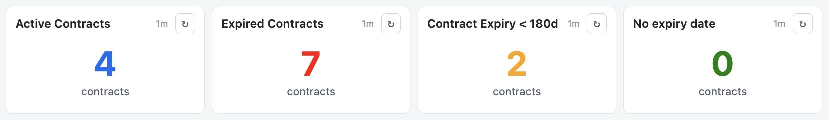
"title": "All Contracts",
"type": "kpiNumber",
"gridColumnSpan": 3,
"gridRowSpan": 1,
"query": {
"objectType": "Document",
"class": "Contract or Agreement",
"aggregation": { "type": "summary" }
},
"display": { "unit": "contracts" }
}
2.1. display.unit
A small text label shown below the number (c.f. above screenshot), indicating the natural unit of the value: “contracts”, “invoices”, “CHF”, “open items” etc… This is purely optional, so you can omit it if the title is already self-explanatory.
2.2. display.decimals
Number of decimal to use for the widget (default 0). This is useful when the reducer isn’t the default count, since a count of object is mandatorily an integer. For example:
"display": { "unit": "CHF", "decimals": 2 }
2.3. display.thresholds
This one is where the KPI tile becomes really useful in management dashboards. The thresholds array colors the number based on the current value. You can either use texts representing colors or the HTML color code:
"display": {
  "unit": "Overdue Invoices",
  "thresholds": [
    { "value": 0,  "color": "green"   },
    { "value": 1, "color": "orange"  },
    { "value": 10, "color": "red" }
  ]
}
The engine applies the color of the highest threshold where currentValue >= threshold.value. So in the example above:
- 0 overdue invoices: green
- 1 to 9: orange
- 10 and above: red
- Below 0 (which would be unusual for a count, but possible for a sum on a money property): falls back to brand blue (#006eef – which can be changed with a configuration on Admin side) with the above example. But nothing prevents you to set a threshold on negative values.
Please note that thresholds apply only to numeric values. When the KPI shows a date (e.g. max on a date property), thresholds are ignored and the brand color stays. That’s the current behavior, and it might change if there is a need that calls for it.
2.4. Reducer types on kpiNumber
All six reducers are supported, with the standard property-type rules:
- count (default): count the number of objects and you do not need to specify the reducerProperty in this case, since it’s taken by default.
- sum, avg, median: numeric / time properties.
- min, max: numeric properties or date / timestamp / time properties.
A few real-world combinations:
// Count
{ "type": "summary" }

// Total revenue
{ "type": "summary", "reducer": "sum", "reducerProperty": "Amount" }

// Average duration
{ "type": "summary", "reducer": "avg", "reducerProperty": "Project duration days" }

// Latest contract expiry
{ "type": "summary", "reducer": "max", "reducerProperty": "Effective through" }

// Oldest open invoice
{ "type": "summary", "reducer": "min", "reducerProperty": "Invoice date" }
The last two return ISO date strings internally, which is then displayed on the end-user side as DD/MM/YYYY (or whatever matches your regional settings like MM/DD/YYYY in the US for example). So, in M-Files Sample Vault you can build a KPI like “Latest contract expiry: 31/12/2026” with three lines of JSON.
2.5. Drill-through on kpiNumber
When drillThroughEnabled is “Yes” at the dashboard level, the entire KPI tile is clickable. A click opens the drill-through modal with all the objects that contributed to the value. This is useful for all types of reducers, to get more details on how the dashboard reached that value.
3. gauge – the dial
The gauge is also driven by a summary aggregation, but it shows the value on a dial against a defined range. It comes in two flavors depending on the property selected for the reducer.
3.1. Numeric mode
This is the default mode and it can be used with any reducer: count, sum, avg, median, or min / max on a numeric property. The scale is in the natural units of the value, with display.min and display.max bracketing the dial.
{
  "id": "",
  "title": "Overdue Invoices",
  "type": "gauge",
  "gridColumnSpan": 6,
  "gridRowSpan": 2,
  "display": { "min": 0, "max": 50, "unit": "invoices" },
  "query": {
    "objectType": "Document",
    "class": "Purchase Invoice",
    "filters": [
      { "property": "Deadline", "operator": "lessThan",
        "value": "@today", "valueType": "dateToken" }
    ],
    "aggregation": { "type": "summary" }
  }
}
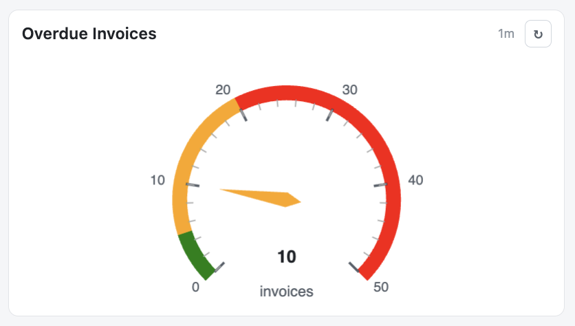
3.2. display.thresholds on a gauge
Same shape as the kpiNumber, but the gauge applies the colors to both the pointer and the arc segments, so the dial visually splits into zones:
"display": {
  "min": 0, "max": 50, "unit": "invoices",
  "thresholds": [
    { "value": 0, "color": "green"  },
    { "value": 5, "color": "orange"  },
    { "value": 20, "color": "red" }
  ]
}
This colors the arc as: 0 to 5 in green, 5 to 20 in orange, 20 and above in red. The pointer also takes the color of the zone where the current value lands. In other words, a glance at the dial tells you whether you are in a comfortable zone, a warning zone, or a critical one (c.f. above screenshot for the example with the colors).
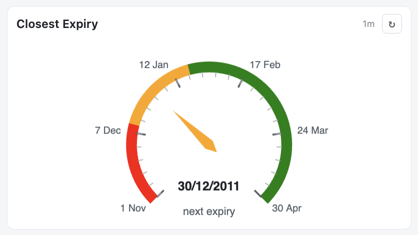
3.3. Date mode
When the reducer is min or max and reducerProperty is a date / timestamp / time property, the gauge switches to date mode automatically. The dial then represents a day offset relative to today:
- display.min and display.max are, for date / timestamp properties expressed in day units, where 0 is today, negative values are in the past, positive values are in the future. For time properties, it is expressed in hours units, where 0 is midnight and 24 is, well, also midnight, but the next one ;).
- Graduation labels show dates like DD MMM if all dates are within a 365 timeframe, or it adds the YY if it goes beyond, so you know which date exactly we are talking about (depends on your regional settings). For time specifically, the graduation switch automatically to HH:mm display.
- The center detail shows the actual date DD/MM/YYYY (in your regional display preference) that comes from the reducer (again, it respects your date regional settings). Or DD/MM/YYYY HH:mm for timestamps or HH:mm:ss for time properties.
{
  "id": "",
  "title": "Closest Expiry",
  "type": "gauge",
  "gridColumnSpan": 6,
  "gridRowSpan": 2,
  "display": { "min": 0, "max": 180, "unit": "next expiry" },
  "query": {
    "objectType": "Document",
    "class": "Contract or Agreement",
    "filters": [
      {
        "property": "Effective through",
        "operator": "greaterOrEqual",
        "value": "@today",
        "valueType": "dateToken"
      }
    ],
    "aggregation": {
      "type": "summary",
      "reducer": "min",
      "reducerProperty": "Effective through"
    }
  },
}
In this example, the dial spans from today to 180 days in the future. If the earliest contract expiry is 22 days from today, the needle lands at the date that represents 22 and the center shows the actual date. If it is already in the past (negative offset), it indicates an overdue situation immediately. (in below screenshot, I’m using dates related to the past, as that’s what is available in the Sample Vault from M-Files, but in a real-world, the above JSON is usable)
3.4. When the reducer cannot produce a numeric value
If you try to use a date reducer on a chart widget (bar, line, area, donut), the widget will show a grey placeholder text, explaining that it is not supported (doesn’t really make sense). Moreover, before that, the administrator that designed the dashboard also got the same warning that this isn’t something that would work.
On a gauge, you have the date-mode escape hatch. On a kpiNumber or a table, the value is just formatted as a date string. So as a rule, date-valued reducers belong on kpiNumber, table, or gauge (date mode). They do not belong on chart widgets.
As said, this rule is not arbitrary, it is what the engine actually enforces. The “Test Widget”, “Test Queries” or “Save” will all tell you the same thing in a friendly way, if you slip or forgot about it.
4. Summary of reducers for scalar widgets
To close this post, here is a quick reference of what works on kpiNumber and gauge:
| Reducer | What it computes | reducerProperty types | Empty set returns |
|---|---|---|---|
| count (default) | Number of matching objects | n/a | 0 |
| sum | Total of the property’s values | Numeric or time | null (rendered as –) |
| avg | Arithmetic mean | Numeric or time | null (rendered as –) |
| median | Middle value | Numeric or time | null (rendered as –) |
| min | Smallest value | Numeric or date / timestamp / time | null (rendered as –) |
| max | Largest value | Numeric or date / timestamp / time | null (rendered as –) |
As described above, there is a subtle difference of “0” vs “-” for the empty results. For the default count, we display “0”, as there was really no objects returned, so the count of them is correct. For all other reducers, if there is no results, then there is nothing to do maths on. To differentiate between “no results” and “sum is really 0” (e.g. -2+2), I decided to display “-” for cases where there is no actual data to compute.
Of course, this empty results set difference is only true when there are no data returned. So if your filter is accurate and you expect some data, then it will never happen.
5. Closing thoughts
kpiNumber and gauge are the two widgets that typically stands at the top of a dashboard. It can be in a row of four KPIs and a gauge below, or side-by-side, depending on the layout defined. They give the at-a-glance answer that motivated the whole module in the first place.
In the next post (4b), I will talk about the trend widgets, line and area, which work in pairs almost as closely as kpiNumber and gauge do here.
Want to know more about this Business Dashboard? Contact us and we will be happy to showcase it on M-Files.
![Thumbnail [60x60]](https://www.dbi-services.com/blog/wp-content/uploads/2022/08/MOP_web-min-scaled.jpg)
![Thumbnail [90x90]](https://www.dbi-services.com/blog/wp-content/uploads/2022/08/GME_web-min-scaled.jpg)
![Thumbnail [90x90]](https://www.dbi-services.com/blog/wp-content/uploads/2022/08/ATR_web-min-scaled.jpg)