As someone who has relied on Vuetify for most of my Vue.js projects, I’m always on the lookout for new libraries that can streamline development and keep designs modern. Recently, a new UI library called FlyonUI was released, and I decided to give it a spin. FlyonUI is a Tailwind CSS Components Library. To my surprise, it turned out to be not only lightweight but also incredibly easy to set up and customize. In this post, I’ll walk you through the basics of integrating FlyonUI with Vue.js.
Why I’m Interested About FlyonUI
Released just a few weeks ago, FlyonUI promises a fresh approach to Vue UI development. FlyonUI is an open-source (I love open-source projects) Tailwind CSS Components Library with semantic classes and powerful JS plugins. It’s designed to be intuitive, flexible and to have universal framework compatibility (Vuejs, React, Angular, …). I like their website and the documentation seems very complete, not even mentioning the fact that there is already more than 78 available components and 800 examples.
Prerequisites
- A basic understanding of Vue.js
- Node.js and npm installed
- Vue.js running application set up with Tailwind CSS (https://tailwindcss.com/docs/guides/vite#vue)
I. Install FlyonUI
I’m going to use the application I created for my previous blog, which you can find here: https://www.dbi-services.com/blog/vue-creating-an-awesome-parallax-effect-with-swiper/. To add FlyonUI, open your terminal in the project’s root folder and run:
npm install flyon-ui
II. Configure FlyonUI in Your Vue App
Now that FlyonUI is installed, let’s import it to make its components available across the app. Open tailwind.config.js and edit the file with the following code:
/** @type {import('tailwindcss').Config} */
export default {
  content: [
    "./index.html",
    "./src/**/*.{vue,js,ts,jsx,tsx}",
    "./node_modules/flyonui/dist/js/*.js",
  ],
  theme: {
    extend: {},
  },
  plugins: [
    require('flyonui'),
    require('flyonui/plugin')
  ],
}
Open main.ts and add the following code:
import "flyonui/flyonui";III. Add a reinitialization helper
Add code in your route file (./src/router/index.ts) to reinitialize components each time the page is refreshed.
import { createRouter, createWebHistory } from 'vue-router'
import HomeView from '../views/HomeView.vue'

import { type IStaticMethods } from "flyonui/flyonui";
declare global {
  interface Window {
    HSStaticMethods: IStaticMethods;
  }
}

const router = createRouter({
  history: createWebHistory(import.meta.env.BASE_URL),
  routes: [
    {
      path: '/',
      name: 'home',
      component: HomeView
    },
    {
      path: '/about',
      name: 'about',
      // route level code-splitting
      // this generates a separate chunk (About.[hash].js) for this route
      // which is lazy-loaded when the route is visited.
      component: () => import('../views/AboutView.vue')
    }
  ]
})

router.afterEach((to, from, failure) => {
  if (!failure) {
    setTimeout(() => {
      window.HSStaticMethods.autoInit();
    }, 100)
  }
});

export default router
IV. Using FlyonUI Components
FlyonUI components are simple and straightforward, so let’s jump into using a few popular ones.
Example 1: Button
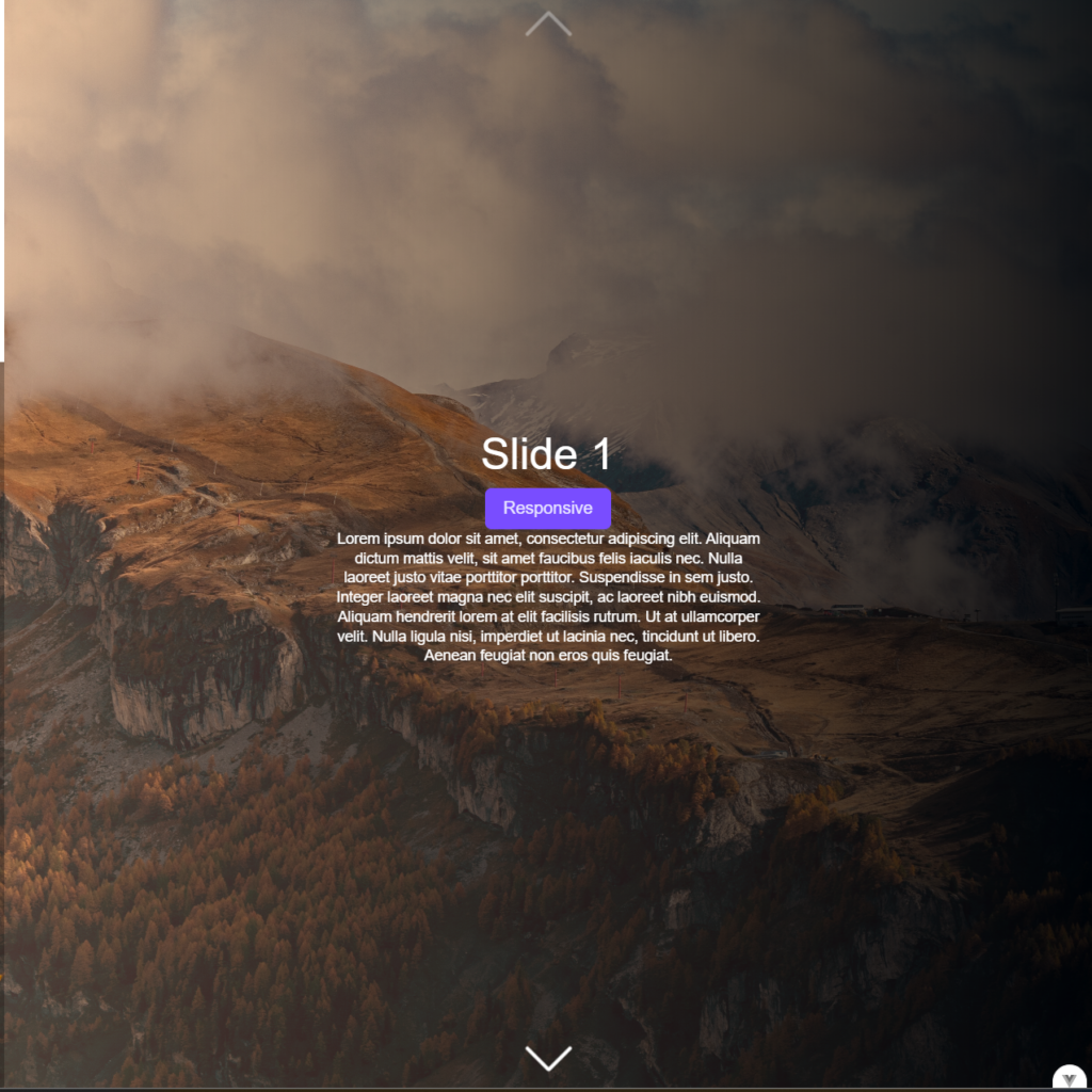
Now you can use FlyonUI components throughout your Vue application. Here’s an example of using a FlyonUI responsive button:
<button class=”btn btn-primary max-sm:btn-sm lg:btn-lg”>Responsive</button>

Example 2: Add a card component
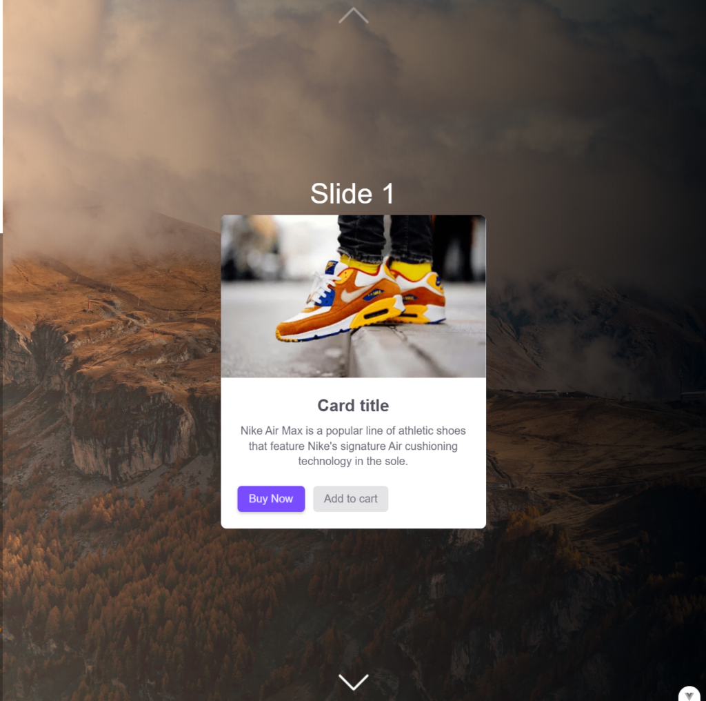
We’ll make it simple and place the card structure below the title of our swiper slide. You can add this code to your component:
        <div class="card group hover:shadow sm:max-w-sm">
          <figure>
            <img
              src="https://cdn.flyonui.com/fy-assets/components/card/image-8.png"
              alt="Shoes"
              class="transition-transform duration-500 group-hover:scale-110"
            />
          </figure>
          <div class="card-body">
            <h5 class="card-title mb-2.5">Card title</h5>
            <p class="mb-6">
              Nike Air Max is a popular line of athletic shoes that feature
              Nike's signature Air cushioning technology in the sole.
            </p>
            <div class="card-actions">
              <button class="btn btn-primary">Buy Now</button>
              <button class="btn btn-secondary btn-soft">Add to cart</button>
            </div>
          </div>
        </div>

Example 3: Use radio buttons to control CSS theme
FlyonUI offers a range of pre-built themes that make it easy to customize the look and feel of your app. Each theme provides a cohesive color scheme applied across all FlyonUI components. To use a theme, simply add its name to your tailwind.config.js.
/** @type {import('tailwindcss').Config} */
export default {
  content: [
    "./index.html",
    "./src/**/*.{vue,js,ts,jsx,tsx}",
    "./node_modules/flyonui/dist/js/*.js",
  ],
  theme: {
    extend: {},
  },
  flyonui: {
    themes: ["light", "dark", "gourmet", "corporate", "luxury", "soft"]
  },
  plugins: [
    require('flyonui'),
    require('flyonui/plugin')
  ],
}
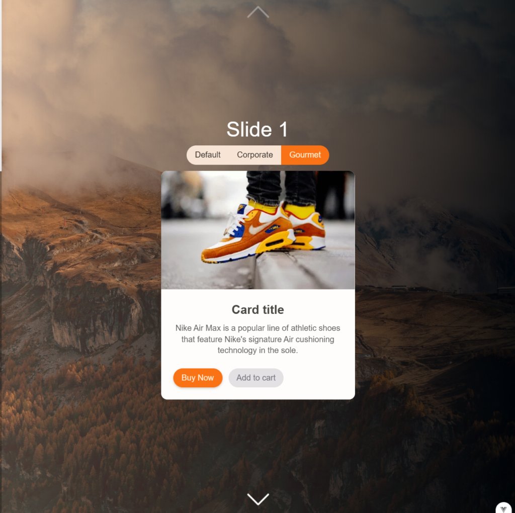
Now let’s add the radio buttons onto our slide and verify that the theme of our card is changing:
        <div class="join join-horizontal pb-3">
          <input
            type="radio"
            name="theme-buttons"
            class="btn theme-controller join-item"
            aria-label="Default"
            value="default"
            checked
          />
          <input
            type="radio"
            name="theme-buttons"
            class="btn theme-controller join-item"
            aria-label="Corporate"
            value="corporate"
          />
          <input
            type="radio"
            name="theme-buttons"
            class="btn theme-controller join-item"
            aria-label="Gourmet"
            value="gourmet"
          />
        </div>

Well, without big surprise, this is working as expected, simple and easy to use. I like how the Gourmet theme is even applying rounded class to our buttons.
V. Advanced Features
FlyonUI also offers advanced components, such as tables, charts, and timeline, to build complex interfaces quickly. Refer to the FlyonUI documentation for detailed customization options, methods, and event handling for each component.
Conclusion
FlyonUI seems like an excellent library for Vue.js developers looking to create modern, responsive, and interactive UIs without a significant performance hit. In this guide, we’ve covered the basics of integrating FlyonUI into your Vue project and using several key components.
Still, FlyonUI is a fresh and evolving library, and it’s clear that the team is still working to expand its capabilities. As you may notice on the official website, some sections are marked as “coming soon.” This means there’s more to look forward to as the library grows and introduces new features. So, stay tuned for updates, enjoy exploring the current components, a big thanks to the developers and have fun testing out FlyonUI!
![Thumbnail [60x60]](https://www.dbi-services.com/blog/wp-content/uploads/2022/08/FRJ_web-min-scaled.jpg)
![Thumbnail [90x90]](https://www.dbi-services.com/blog/wp-content/uploads/2022/08/NME_web-min-scaled.jpg)