In this post, we’ll walk through how to implement a Global and Custom Snackbar in Vue 3 with Vuetify and Pinia for state management. We’ll set it up so that you can easily trigger the Snackbar from any component in your app.
I. Set Up Your Vue App with Vuetify CLI
To start, we’ll create our Vue 3 app using the Vuetify CLI. This CLI simplifies the process of integrating Vuetify and sets up your project structure.
npm create vuetify@latest
Follow the prompts to choose your project settings and install dependencies. As we are going to use Pinia, don’t forget to choose this option. I decided to keep all the generated files to keep it simple and straightforward, but you can clean the code that was automatically generated. I just cleaned the component HelloWorld.vue, that now looks like this:
<template>
  <v-container class="fill-height">
    <v-responsive class="align-centerfill-height mx-auto" max-width="900">
    </v-responsive>
  </v-container>
</template>

<script setup lang="ts">
</script>
II. Set Up the Pinia Store for Snackbar
Next, create a Pinia store (SnackbarStore.ts) to handle the state of the Snackbar (open/close, message, status, etc.). This will allow you to trigger the Snackbar from anywhere in the app.
// SnackbarStore.ts inside stores directory

import { defineStore } from 'pinia'
import { Ref, ref } from 'vue'

export interface CustomAction {
  actionName: string;
  link: any;
}

export const useSnackbarStore = defineStore('SnackbarStore', () => {
  const isOpen = ref(false)
  const message = ref('')
  const status = ref('error')
  const customActions: Ref<CustomAction[]> = ref([])

  const showSnackbar = (msg: string, st: string, optionalActions?: CustomAction[]) => { // Change to accept an array
    message.value = msg
    status.value = st
    isOpen.value = true
    if (optionalActions) {
      customActions.value.push(...optionalActions) // Spread the array into customActions
    }
    if (status.value.toLowerCase() === 'success') {
      setTimeout(() => {
        closeSnackbar()
      }, 2500)
    }
  }

  function closeSnackbar () {
    isOpen.value = false
    customActions.value.splice(0, customActions.value.length) // Clear custom actions
  }

  return { isOpen, message, status, showSnackbar, closeSnackbar, customActions }
})
III. Create the Snackbar Component
We’ll create a reusable Snackbar component (GlobalSnackbar.vue) that can be used anywhere in your application.
<template>
  <div class="text-center">
    <v-snackbar
      v-model="snackbarRef"
      class="customSnackbar"
      :color="snackbarStatus"
      variant="outlined"
      vertical
    >
      <div class="text-subtitle-1 pb-2 title-custom">{{ snackbarStatus }}</div>

      <p>{{ errorMsg }}</p>

      <template #actions>
        <v-btn
          v-for="act of snackbarActions"
          :key="act.actionName"
          :to="act.link"
        >
          {{ act.actionName }}
        </v-btn>
        <v-btn variant="tonal" @click="closeSnackbar"> Close </v-btn>
      </template>
    </v-snackbar>
  </div>
</template>

<script lang="ts" setup>
  import { toRef } from 'vue'
  import { CustomAction, useSnackbarStore } from '@/stores/SnackbarStore'

  // Define the properties that the component will receive
  const props = defineProps({
    snackbarShow: Boolean,
    errorMsg: String,
    snackbarStatus: String,
    snackbarActions: {
      type: Array as () => CustomAction[], // Custom type to define snackbar actions
    },
  })

  const snackbar = useSnackbarStore()
  const snackbarRef = toRef(props, 'snackbarShow')

  const closeSnackbar = () => {
    snackbar.closeSnackbar()
  }
</script>

<style>
.customSnackbar.v-snackbar--vertical .v-snackbar__wrapper {
  background-color: rgb(238, 238, 238);
}
.title-custom {
  text-transform: uppercase !important;
}
</style>
IV. Modify App.vue to Include the Global Snackbar
To ensure the Snackbar is available across your entire app, import it into App.vue and pass the required props from the SnackbarStore.
<template>
  <v-app>
    <v-main>
      <router-view />
    </v-main>
    <GlobalSnackbar
      :error-msg="snackbar.message"
      :snackbar-actions="snackbar.customActions"
      :snackbar-show="snackbar.isOpen"
      :snackbar-status="snackbar.status"
    />
  </v-app>
</template>

<script lang="ts" setup>
  import { useSnackbarStore } from '@/stores/SnackbarStore'
  const snackbar = useSnackbarStore()
</script>
This step is essential to making sure the GlobalSnackbar component is part of the root layout and is always available to display messages.
V. Using the Snackbar in a Component
Now, let’s demonstrate how to trigger the Snackbar from any component. For this example, we’ll use a button that, when clicked, shows a success message with an optional action. We can edit HelloWord.vue with following code.
<template>
  <v-container class="fill-height">
    <v-responsive class="align-centerfill-height mx-auto" max-width="900">
      <v-btn @click="openSnackbar()">test</v-btn>
    </v-responsive>
  </v-container>
</template>

<script setup lang="ts">
  import { useSnackbarStore } from '@/stores/SnackbarStore'
  const snackbar = useSnackbarStore()

  const openSnackbar = () => {
    snackbar.showSnackbar('Show snackbar', 'success', [
      { actionName: 'Go to Home', link: '/home' },
      { actionName: 'Go to Test', link: '/test' },
    ])
  }
</script>
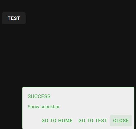
VI. Testing the Snackbar
Once everything is in place, try clicking the button to trigger the Snackbar. You should see the Snackbar with a success message and an optional action button appear at the bottom of the screen. And Logically, if you click on one of the custom action buttons, it will redirect you properly, but you will obviously see a blank page, as the view doesn’t exist.
Conclusion
In this post, we created a global and custom Snackbar component in Vue 3 using Vuetify and Pinia. We set it up so that it can be easily triggered from anywhere in the app. By managing its state with Pinia, we keep the logic centralized and clean, making the Snackbar reusable across the entire application.
Feel free to adjust the styling and functionality of the Snackbar to suit your needs. Now you have a flexible, easy-to-use notification system for your Vue 3 project!
![Thumbnail [60x60]](https://www.dbi-services.com/blog/wp-content/uploads/2022/08/FRJ_web-min-scaled.jpg)
![Thumbnail [90x90]](https://www.dbi-services.com/blog/wp-content/uploads/2022/08/NME_web-min-scaled.jpg)