As a consultant, I often use Performance Monitor (Perfmon) to collect performance metrics for SQL Server. After running Perfmon for, say, a week to capture a baseline of server activity, you can end up with a large amount of data.
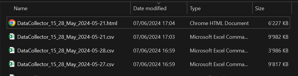
Here’s what you might end up with:
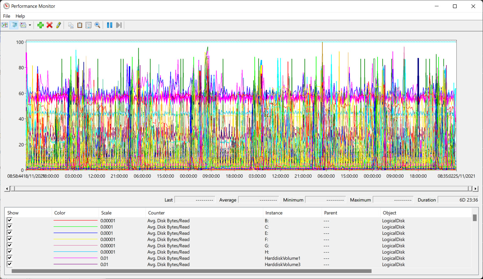
Looking at so much information can be overwhelming if you don’t know exactly what you are looking for. So, how can we extract some useful information from that?
Well, there are not many options:
- A commonly used tool is PAL (Performance Analysis of Logs) but I’ve never been a big fan. It’s not always easy to get relevant information from it.
- Another way is to convert your Perfmon log (blg file) to a CSV file and then use Excel to perform data analysis using pivot tables and charts. However, this process can be tedious and time-consuming.
- You can also use Power BI to display, filter, and graph the data from the CSV file. This might be the best option, but I’m not very comfortable with Power BI yet.
Not satisfied with these solutions, I decided to build a tool myself.
While I usually rely on PowerShell for database administration tasks, for this one I was ready to try something new. Python, often referred to as the most popular programming language, has seen exponential growth the past years thanks to its use in Data Engineering, Data Science, and Machine Learning.
Although I had never tried Python before, I believe it’s never too late to learn something new.
So here it is. I wrote a small script two years ago (writing a blog post takes time, right?) to help me analyze Perfmon counters.
I named it blg2graph and it’s available on GitHub.
How to use
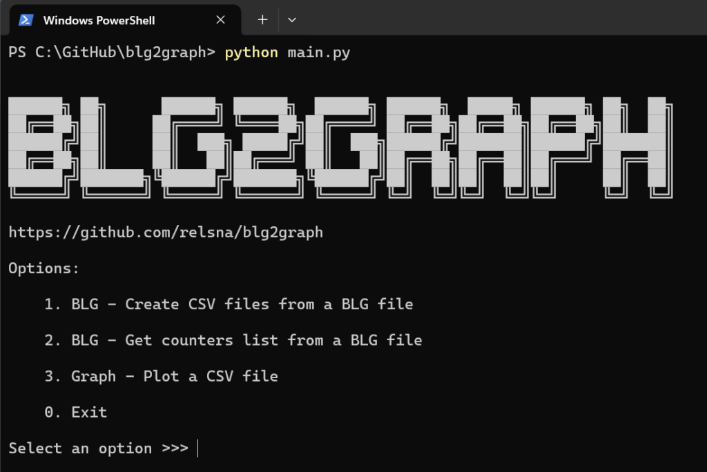
When you run the main.py script, several options are available:
- Create CSV files from a Perfmon BLG file.
- Get the counters list from a BLG file, mainly for troubleshooting.
- Create graphs from a CSV file.
Here’s how I use it:
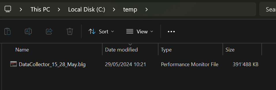
First, I start with a single binary .BLG file containing data collected over several days.
Using blg2graph, I transform this BLG file into multiple CSVs, one per day.
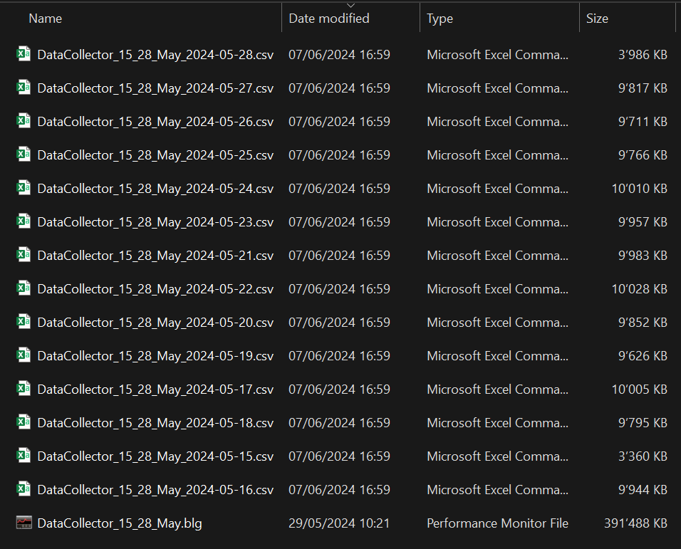
Finally, I generate graphs for a specific CSV file, i.e., for a particular day.
Output
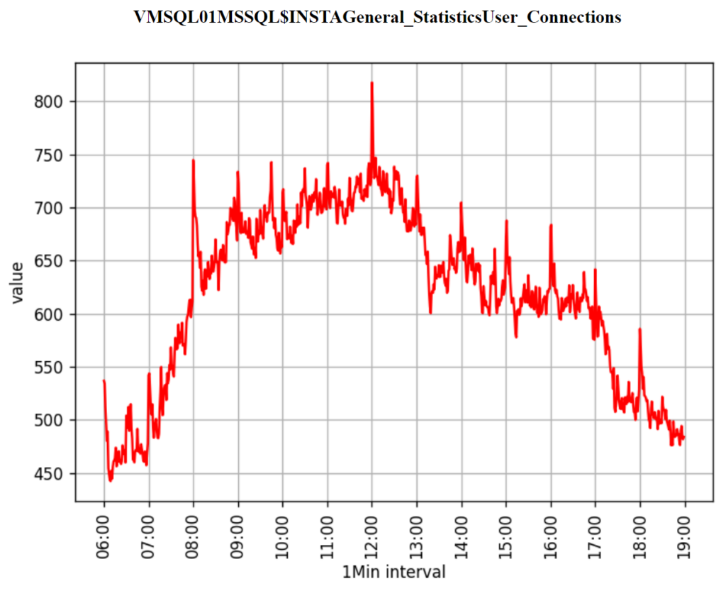
Here is the result, an HTML file containing a chart for each Perfmon counter for a given day.
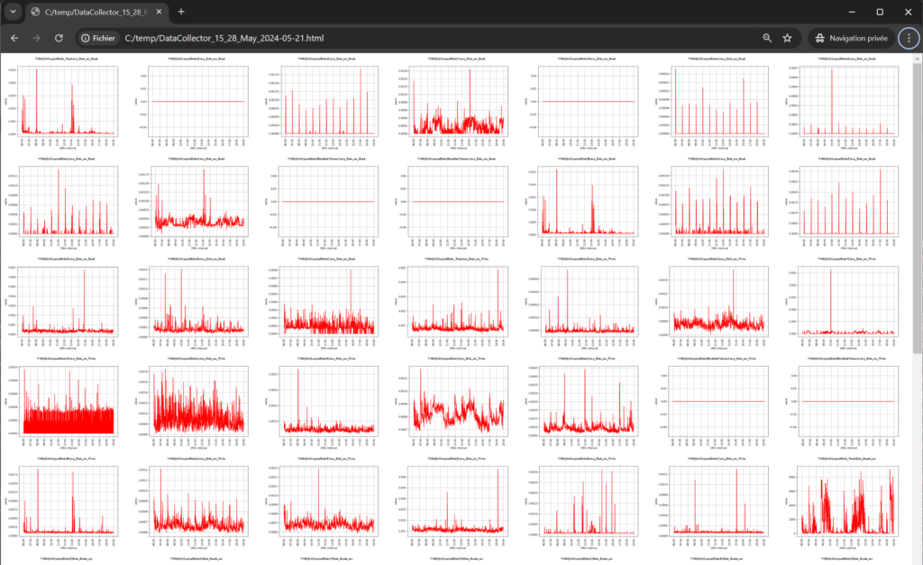
I can now search for the data I am interested in, investigate, try to identify anomalies, and finally use these graphs to illustrate a report or documentation.
Configuration
I can choose the time range to be used for generating the graphs by modifying the JSON configuration file: config.json.
"timeframe":{
        "group_interval":"1Min",
        "start_time":"06:00:00",
        "end_time":"19:00:00"
    }
I can also choose to generate only specific graphs. To do this, I list the Perfmon counters in the JSON file under “includeCounters” and set the “Apply” property to TRUE.
If set to FALSE, the script will generate graphs for all counters present in the CSV file.
"includeCounters":{
        "Apply":false,
        "counters":[
            "Buffer Manager\\Buffer cache hit ratio",
            "Transactions/sec",
            "Priviledged Time/sec"
        ]
    }
Alternatively, I can exclude certain counters using the “excludeCounters” object.
Installation
Here are the steps to install Python and run the script on a Windows machine:
- Install Python:
- Go to the official Python website. Download and install the latest version.
- Don’t forget to enable the checkbox “Add Python to PATH”.
- Download the Python script:
- If you have Git installed run
git clone https://github.com/relsna/blg2graph.git. - If you didn’t install Git, go to the repository page, click on “Code”, then “Download ZIP”.
- If you have Git installed run
- Install the required Python packages:
- Open Command Prompt, or PowerShell Prompt or Terminal and navigate to the directory where you downloaded the script
cd C:\GitHub\blg2graph. . - Run
pip install -r requirements.txtto install the required Python packages.
- Open Command Prompt, or PowerShell Prompt or Terminal and navigate to the directory where you downloaded the script
- Run the Python script:
- Still in the same directory, run
python main.pyto start the script.
- Still in the same directory, run
Next steps
In its current state, it is still not easy to analyze the data when there are dozens or even hundreds of graphs on the HTML page.
The next features I want to prioritize for development are:
- The ability to group the graphs by instance when the CSV contains counters from multiple SQL Server instances on the same Windows server.
- Creating graphs that correlate data from multiple performance counters, for example, to show the evolution of transactions per second and batch requests per second. This could then be configured in the JSON file as follows:
"graphs":[
        {
            "category":"SQL Activity",
            "title":"SQL Activity",
            "kind":"line",
            "colors": ["g", "b"],
            "counters":[
                "SQL Statistics\\Batch Requests/sec",
                "Transactions/sec"
            ],
            "threshold": null
        },
        {
            "category":"Buffer",
            "title":"CPU",
            "kind":"line",
            "colors": ["g", "b"],
            "counters":[
                "Buffer Manager\\Buffer cache hit ratio",
                "Buffer Manager\\Page life expectancy"
            ],
            "threshold":"80"
        }
]
Conclusion
Analyzing performance counter data can be hard work. While PAL can significantly ease the pain of analyzing performance counter logs, I found it not quite fitting my needs.
That’s why I created blg2graph, a Python script that simplifies the analysis process and helps visualize the data effectively. I use it regularly and I think it could be useful to you if you need to analyze perfmon performance counters.
This is a first working version, and I’m looking forward to improving it. Please use it and share your feedback here in comments or on the GitHub repo!
Written by Steven Naudet
![Thumbnail [60x60]](https://www.dbi-services.com/blog/wp-content/uploads/2022/12/microsoft-square.png)
![Thumbnail [90x90]](https://www.dbi-services.com/blog/wp-content/uploads/2022/08/STH_web-min-scaled.jpg)
![Thumbnail [90x90]](https://www.dbi-services.com/blog/wp-content/uploads/2022/11/TBR-web-min-scaled.jpg)
![Thumbnail [90x90]](https://www.dbi-services.com/blog/wp-content/uploads/2025/11/LTO_WEB.jpg)
![Thumbnail [90x90]](https://www.dbi-services.com/blog/wp-content/uploads/2023/01/APY_web-scaled.jpg)
Esl
10.06.2024Hi Steven,
Nice work