In the preceding article “plot-ds.py, A Simple Plotting Command-Line Tool” available here, we presented the tool plot-ds and gave enough instructions to get you started with it. In the present article, we will dive into the details of the script.
plot-ds.py
Being targeted at administrators or other IT personnel, its user interface and error handling is quite crude and basic. Think of it as a POC rather than a complete, well-polished product, so caveat emptor. On the positive side, the source code is just 2 letters away (vi …) so it is easy to fix or enhance it.
The python script plot-ds.py takes all its parameters from the command-line. Here is their syntax:
plot-ds.py
[-h		| --help]
[-t		| --supertitle=string]
-f              | --files=file_name{,file_name}}
[-tt		| --titles=string{,string}]
[-gg		| --pie-geometry=geometry{,geometry}]
[-s		| --save-as=[!]file_name{,[!]file_name}]
[-b		| --save-as-format=format{,format}]
[-g		| --geometry=geometry]
[-sa		| --save-all-as=[!]file_name]
[-ba		| --save-all-as-format=raw|rgba|png|jpg|jpeg|tif|tiff|ps|pgf
                                       |pdf|eps|svg|svgz]
[-x		| --crosshair_cursor]
[-I		| --interactive]
[-l		| --log]
[-n		| --save-no-file]
[-nst		| --no-stats]
[-ndf		| --no-distfit]
Short or long options are accepted, e.g. -h or --help. In both cases, an equal sign ‘=’ can follow the argument name.
The only mandatory parameter is obviously at least one file containing the data set to plot. Files are specified through the --files option and there can be several such options listed on the command line. Moreover, several files can be grouped in the same --files option so they can be plotted in the same graph if their graph type is identical, otherwise only the first one will be plotted (this restriction can be somewhat mitigated by plotting in separate groups). This makes it possible to have several comparable curves (let’s use here the generic term “curve” for any type of data plot) in the same graph when needed, along with graphs for single data sets.
Each file group can have its own title (from parameter --titles), geometry (from --geometries) for pie charts (because pie charts cannot be stacked in the same graph, they each need their own graph and if grouped, a geometry can be specified through the --pie-geometries command-line option, not to be confused with the global page’s --geometry), output file (from --save-as) and format (from --save-as-format). Their respective position in those lists corresponds to the listed files in --files. Missing (e.g. with lists of different length) or empty values (e.g. --titles=title1,title2,,title4…) are accepted as empty values.
In addition to grouped plots, a global page containing all the group graphs is produced and can be saved its own way as specified in --save-all-as and --save-all-as-format. Also, graphs can be saved individually for each data set if specified through a header line in their respective data file.
If --crosshair-cursor is provided, values in the graphs can be shown when the mouse hovers over the curve. Obviously, this is only possible if the --interactive option is also active. If not, optionally, the graphs are only output into files, either as groups and/or single (more about this later), and/or into the global page.
If --log is present, the data structure containing all the parsed data, including the data sets themselves, along with some messages, are output on stdout, which is helpful when troubleshooting.
The above geometries have the following format: nb_lines x nb_cols. It defines a grid in a page (a figure in Matplotlib parlance; it is displayed in a pop-up window) with nb_lines rows times nb_cols columns; graphs will be plotted in each grid’s cells. geometries can be used in grouped plots and in the overall plot. It defaults to as many 3-column rows that can contain all the required graphs. Cells in excess, i.e., empty, are removed from the page.
When specifying output file names, it is possible to make clear what to do if the file already exists: shall it be overwritten or preserved ? To this effect, a concise syntax is used: an exclamation mark as a prefix in the file name means “replace the existing file”, whereas if omitted the new file name will be suffixed a time stamp formatted as “_YYYYMMDDHHMMSS” right before the dot and the extension if any, e.g., mygraph_20230311123846.pdf. Thus, by default, existing files are never overwritten unless explicitly requested. A word of caution here: when using the bash shell, enclose between single quotes the parameters containing an exclamation mark as they may be subject to unwilling interpretation by the shell and cause an error.
Supported graph file formats are: raw, rgba, png, jpg|jpeg, tif|tiff, ps, pgf, pdf, eps, svg, svgz.
The default format is svg as its lossless scalability gives the best visual result.
As hinted above, data sets are also plot, and optionally individually saved to files, in addition to being possibly plot in groups and in the global page. This is defined in the header line that is prepended to the data in its file. This header is formatted as follows:
graph_type | title | x-axis label | y-axis label | min-x | max-x | min-y | max-y | legend | [[!]save-as] | [save-as-format] [ | nb_bins]
where the separator is the pipe sign ‘|’, graph_type defines how the data will be plot and is one of timeseries, histogram, bar (for vertical bars), line, scatter, stem, pie or bucket.
e.g.:
histogram|Time to Rendition (time_to_render1_50.csv)|duration [s]|frequency|||||rendition time|!tr.pdf|pdf|20
Here, a histogram is requested, with “Time to Rendition (time_to_render1_50.csv)” as the title, the x-axis values are “duration [s]” and the y-axis values are “frequency”, no rectangular limits on the data are specified. Moreover, the plot will have “rendition time” as the curve’s legend and will be saved as pdf to the file tr.pdf overwriting it if it already exists. This particular type of graphs accepts an optional, additional parameter, the number of bins to aggregate the data into, corresponding to the number of vertical bars that will be plot in the histogram. Here is an example of such a file:
histogram|Time to Rendition (time_to_render1_50.csv)|duration [s]|frequency|||||distribution (1/50)|!tr1.pdf|pdf|20
1.6
3.3
2.6
2.6
4.6
…
Following the header line, the raw numbers fill the file to the end.
Here is another example with a data set file to be plot as a pie chart:
pie|Energy Consumption in 2020 (fake_14_pie-1.csv)|country|energy [Mtoe]|||||cons. vs. country (1/14)|!pie-1-14.pdf|pdf
Belgium,51
Czechia,39,e
France,217
Germany,275
In this example, data have 2 fields plus an optional one, e for “exploded”, for pie charts only and with the effect to slightly offset that particular slice out of the pie for more emphasis or enhanced visibility.
Unused parameters can be left empty between their vertical bars.
When upgrading the script, extra parameters can be added as needed, just add support for their parsing or they will simply be ignored.
Statistics
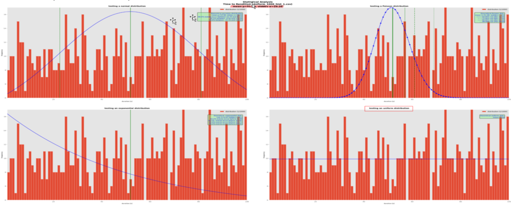
After all the above plots have been produced, a rudimentary, and still graphical, statistical analysis is performed. Given the limited requirements, knowledge in data science is not really necessary here. Instead, we propose something simpler and still visual to keep in line with the approach: the eligible data sets (i.e. the ones requesting a histogram or dataseries) to be plotted as red histogram bars are graphically compared against most frequently used theoretical probability distributions (normal, Poisson, exponential and uniform) for the human eyes to decide which one best fits the actual data, if any. One graph for each theoretical distribution’s probability density function is plotted along the data set, plus one graph for the quartiles, plus one graph for the cumulative distribution function, so we end up with a page containing 6 2-plot graphs. This page can also be optionally saved to a disk file named after the --save-all-as command-line parameter but with a -stat suffix inserted before the extension, if any. The theoretical curves are plotted as the blue curves. Each graph will show in a box with a green background some statistics computed from the theoretical curve, e.g.:
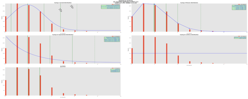
It is quite obvious here that the theoretical Poisson distribution best fits the real data with mean 1.94. We plotted the theoretical curves using this mean and for each of them computed a few quantiles of interest, the green vertical lines. In all the distribution graphs, the mean is shown with a green solid vertical line, and the quantiles with dashed, dash-dotted and dotted vertical, green lines. Their respective value is written in the green boxes.
In this Poisson distribution with mean 1.94, we can say that in 50% of the cases, we counted 2 or less requests, with up to 6 requests covering 99% of the cases, in the observation time window. To make more sense of this, let’s suppose that we are plotting the number of requests to a rendition service in 5-minute intervals. In such use cases when the requests arrive randomly, chances are that the data follow a Poisson distribution.
Note that the Poisson curve has dots in it for its computed values; as it is a discrete distribution, the lines between dots are just intrapolations for a more pleasant display and don’t apply in reality.
Another typical example follows:
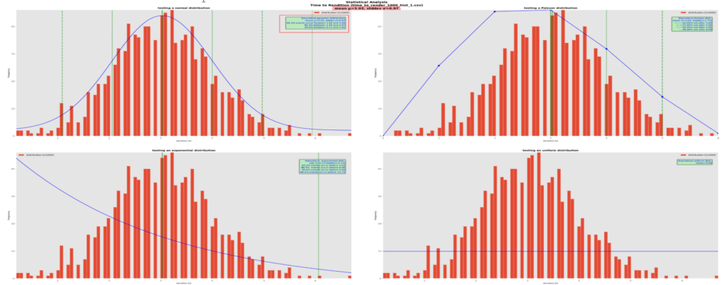
Here, a theoretical normal distribution, with its well-known bell-shaped curve, best fits the actual data. The theory tells that once its mean µ and standard deviation σ are known, about 68% of the values lie between µ-σ and µ+σ, about 95.5% between µ-2σ and µ+2σ and 99.8% between between µ-3σ and µ+3σ, no question asked. Again, this is clearer if we imagine that the values are durations, e.g., the times to produce a pdf rendition. Here, 68.8% of the renditions are generated between 2 and 4 seconds approximately, which is excellent and not so unrealistic as confirmed by observation.
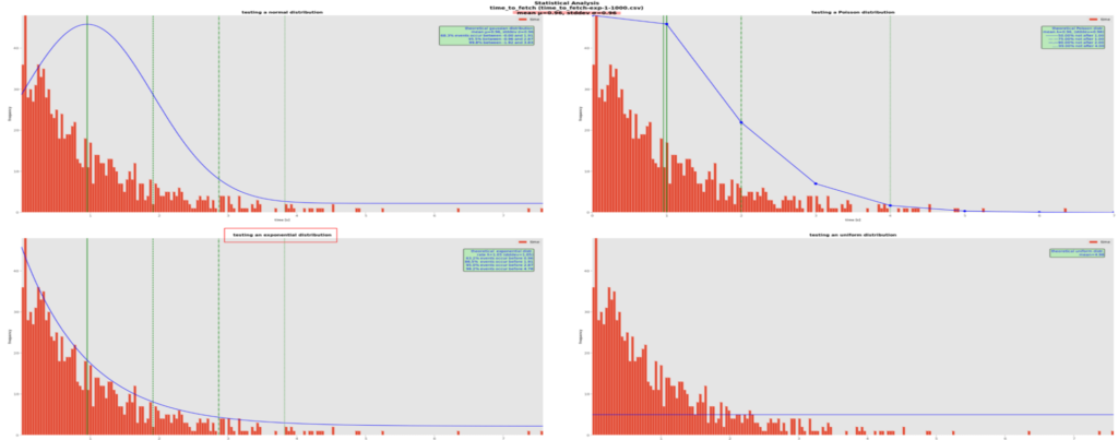
There are cases where visually deciding which theoretical distribution is the best is not so easy, especially with so few data (1000 points here, which is not that many in terms of probability). Here is an example:
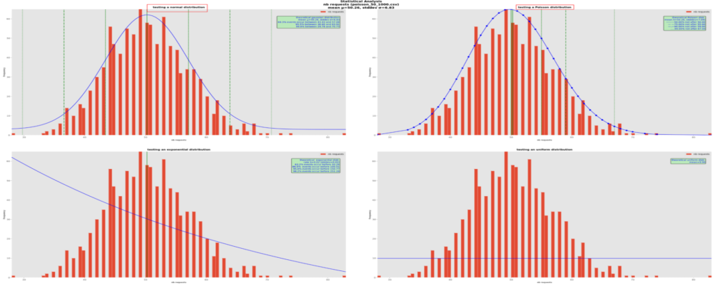
Here it is hard to decide between a normal (on the upper right) and a Poisson (on the upper left) distributions. In effect, the theory says that when the mean is large, like here with about 50s instead of previously 3s, Poisson probability distributions tend towards normal ones. Using mathematical methods such as RSS or Quantile-Quantile plots could help pinpoint the best one(s), which is one feature of distfit.
For the mathematically inclined reader, plot-ds also uses the distfit package and plots many major distributions’ probability density functions in a separate graph page:
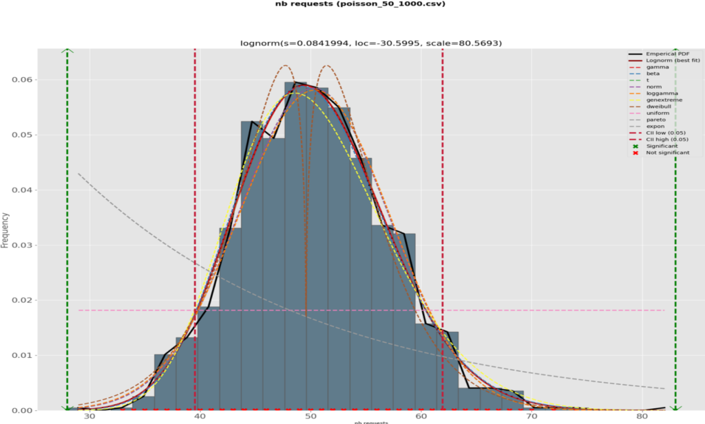
along with a comparative plot of the RSS per theoretical distribution:
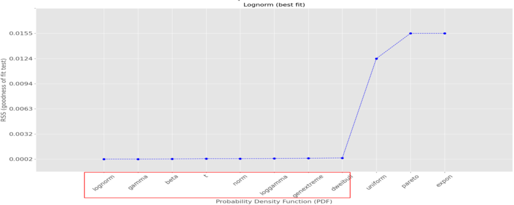
We can see that several theoretical distributions fit this data set very well, i.e., with a small RSS (the smaller, the better); also, the difference between the good ones are minimal and although the log-normal one is the best with the lowest RSS, 9 others among which the normal distribution are also very good. In this case, let’s go for it as its main quantiles are well known.
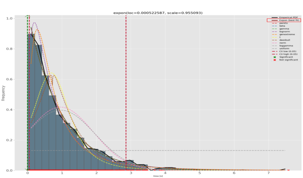
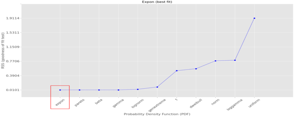
Here is another example, this time for an exponential distribution:
The best-fitting theoretical curve is the exponential one. Those distributions are related to the Poisson ones in that instead of counting the number of events during a time interval, they count the elapsed time between 2 similar events. In our real-life case, we could be interested in measuring the rate of incoming rendition requests. In our example, the computed quantiles in the green box tell us 63.2% of the event are at most 0.96s apart, that 86.5% are at most 1.91s apart, etc.distfit fully confirms our visual choice:
A final example with uniformly distributed random data:
Here, our fake data were generated using a uniform random distribution and we can notice immediately that none of the theoretical distribution fits it, except appropriately the uniform one on the bottom right cell. Had we plotted it using a histogram, we would have as many bars as the red ones and the graph would look really ugly. Instead, we only drawn a horizontal blue line. Note that although the data set’s real mean is 51.9s here, the line is at 10 (or more correctly, 1000/101 = 9.9) because the graph counts the frequency of occurrences of the bins’ x-values. The theoretical distribution is computed for each bar of the histogram, that is 1000 points in the data set divided in 101 bars, i.e. 9.9 occurrences of those values.
At this point, the usefulness of this analysis should be clear: we reduced the whole data set to just 1 or 2 numbers, the best theoretical distribution’s parameters. For example, if it has been observed that a normal distribution fits the real data best, those can be summarized with the distribution’s mean and standard deviation. For a Poisson distribution, the mean is enough to characterize the data, for an exponential distribution the mean (actually its inverse, the rate) is enough, and for a uniform random distribution, the mean. The resulting quantiles can also help take decision about the service under scrutiny, e.g. monitor and report its performances, compare it against an SLA, detect any disruptions or degradation of the expected performances.
In our rendition case, if the performances shown by the quantiles are unacceptable, this could be a sign that some scaling to add more processing power is in order. If the service is implemented as a single process, more core power should be added (e.g., more milli-cores in a kubernetes pod), whereas if the timings include the time a request is waiting in a queue before being fetched and processed, more workers should be added, either full processes or threads, depending on the service’s architecture. The interpretation of the performance is of course subject to the service being monitored and how it was installed and configured.
Examples of execution
Invoking plot-ds can be as simple as:
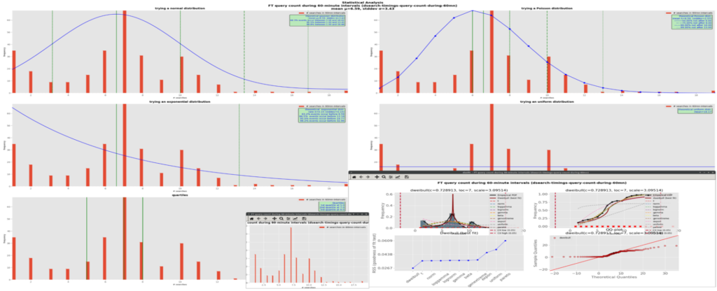
./plot-ds.py --files=dsearch-timings-query-count-during-60mn.data --interactiveThe data set in file dsearch-timings-query-count-during-60mn.data is plot on the screen and no output file is produced. Here is a screen copy showing a mashup of all the 3 windows together:
In batch mode, the above command could become:
./plot-ds.py --files=dsearch-timings-query-count-during-60mn.data -–save-all-as='!dsearch-timings-query-count-during-60mn.svg' --save-all-as-format=svgThe data set in file dsearch-timings-query-count-during-60mn.data is plot in a page and saved into the file dsearch-timings-query-count-during-60mn.data.svg with format svg; the output file is overwritten if it already exists. Here are the created files:

The graph will not be displayed on the screen. Such syntax could be used in scripts for example.
A more complex example could be:
./plot-ds.py \
--files=time_to_render_1000_hist_1.csv,uniform_1000_hist_1.csv \
--files=fake_1000_ln-1.csv \
--files=oil_14_pie-1.csv,oil_14_pie-2.csv \
--files=dummy_100_ts_1.csv \
--titles=group1,group2,group3,group4 \
--geometries=2x1 \
--save-as='!histo1,line2,!pie3,!ts4' \
--save-as-format=svg,,pdf,png \
--geometry=2x2 \
-t Demo \
--save-all-as='!demo' \
--save-all-as-format=svg \
--crosshair_cursor \
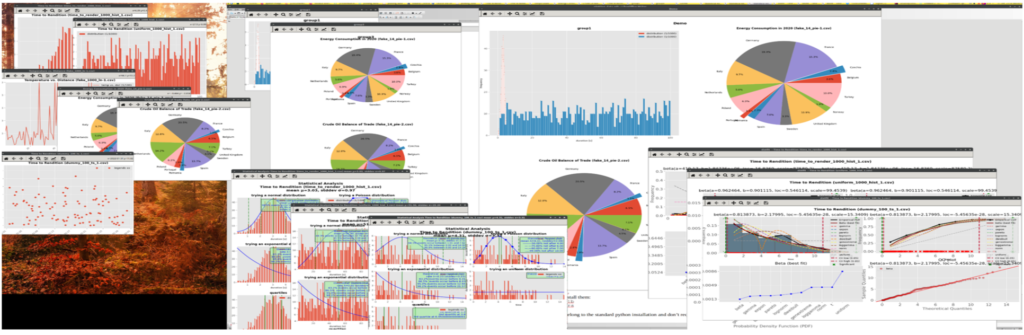
--interactiveHere, in addition to the individual data sets’ graphs, 2 groups of data sets are plot in their respective graph.
The first graph will plot a curve for the data set from file time_to_render_1000_hist_1.csv, and one curve for the one in file uniform_1000_hist_1.csv; its title will be group1 and it will be saved in the svg file histo1 overwriting the file with the same name if it exists.
The second graph will plot the data set from files oil_14_pie-1.csv and oil_14_pie-2.csv, with the title group3 and output pdf file pie3, with possible replacement of an existing file with the same name. Moreover, its graphs will be stacked vertically on the same page (--geometries=2x1). There will be no group2 and group4 graphs as those groups contain only one data set to plot, which is equivalent to their respective individual plots of fake_1000_ln-1.csv and dummy_100_ts_1.csv.
If requested in the data file themselves, individual graphs will also be saved into their respective file, format and replacement modality.
All the group graphs will be plotted in a global page in a 2-row by 2-column grid; as they are 1 eligible group and 2 pie charts, the 4-cell grid is too much and the cell in excess will be removed. The global page will be saved in svg file demo with possible replacement of an existing file.
This execution will be interactive, which means that all the graph pages will be displayed on the screen as well. A crosshair cursor will be shown when hovering over the curves with the mouse.
To summarize, the above command will display 6 individual graphs, 2 grouped graphs, 1 for the global page, 3 stat graphs for each eligible data set and 3 distfit graphs for the same eligible data sets, i.e., 15 on-screen graphs and, assuming the individual data sets asked for it, as many graphic disk files, quite a lot. It is possible of course to reduce the number of files at the individual data set level (leave empty the related setting in the file), at the group level (leave empty the corresponding positional value in --save-as), or don’t bother and just override all those parameters with the --save-no-file command-line option, which is handy when studying the data and no report is needed at that point yet. To reduce the number of displayed graphs, just reduce the number of files in the respective --files options or reduce the number of --files options. Or just don’t use the interactive mode by omitting the --interactive option. Of course, if --interactive is omitted and --save-no-file is present, no output will be produced, either on screen or on disk; still, it may be useful as a dry run to check the integrity of the data files and command-line parameters.
Here is a mashup of how the above command looks on the screen:
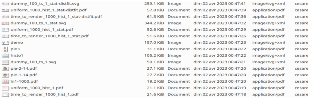
And here are the created disk files:
Installation
As plot-ds.py requires the Matplotlib library, the latter must be installed beforehand. Also, the crosshair cursor requires the library mplcursors. In addition, the distfit package is also required.
Use the following commands to install them:
# use pip or pip3 depending on the environment;
$ pip3 install matplotlib
$ pip3 install mplcursors
$ pip3 install distfit
Under a non-linux O/S, e.g. Windows, the installation could go as follows:
# install python, e.g. 3.10
$ python -V
> Python 3.10.10
$ pip install --upgrade pip
$ pip install matplotlib
$ pip install mplcursors
$ pip install PyQt5
$ pip install distfit
Simple test on the command prompt:
$ plot-ds.py --files=fake_100_bar-1.csv –interactiveMore complex test:
$ plot-ds.py --files=time_to_render_1000_hist_1.csv,uniform_1000_hist_1.csv \
                  --files=fake_1000_ln-1.csv                \
                  --files=oil_14_pie-1.csv,oil_14_pie-2.csv \
                  --files=dummy_100_ts_1.csv                \
                  --titles=group1,group2,group3,group4      \
                  --pie-geometries=2x1                      \
                  --save-as='!histo1,line2,!pie3,!ts4'      \
                  --save-as-format=svg,,pdf,png             \
                  --geometry=2x2                            \
                  -t Demo                                   \
                  --save-all-as='!demo'                     \
                  --save-all-as-format=svg                  \
                  --crosshair_cursor                        \
                  --interactive
If testing from the PowerShell prompt, enclose the comma-separated lists between single or double quotes.
The other used packages, such as numpy and scipy, already belong to the standard python installation and don’t require any further manipulation.
Test data
Data for testing can come from real cases or can be programmatically generated using python libraries such as numpy or scipy, or even computed from scratch (cf. here) but it is quicker to get them for free from the mock up site Mockaroo (here). This site offers several types of random numerical or categorical data. For our needs, we defined data sets with random numbers following exponential, normal, Poisson and, the default, uniform distributions.
Here is how to define one such set:

Here, we created a configuration (or schema as Mockaroo calls them) named “1st one”, with 2 fields: a time stamp formatted as “yyyy-mm-dd hh:mi:ss” and a duration, a random float number following a normal statistical distribution N(5, 4), i.e. with mean μ=5 and standard deviation σ=4. The Preview function allows to quickly see on the web page how this data set looks like:
| timestamp | duration |
|---|---|
| 2022-12-20 01:10:02 | 8.0 |
| 2022-04-29 18:20:03 | 4.5 |
| 2022-10-19 22:46:34 | 11.4 |
| 2022-05-10 16:59:18 | 1.5 |
| 2022-11-16 00:35:15 | 5.0 |
| 2022-06-11 06:22:51 | 0.5 |
| 2022-05-30 18:28:08 | 1.9 |
| 2022-07-27 12:44:59 | 10.4 |
| 2022-11-27 09:20:30 | 5.4 |
| 2022-03-01 16:20:41 | 4.5 |
| … | … |
For our tests, we also requested Poisson-, exponential- and uniform-distributed data sets.
Some nice features of Mockaroo include the possibility to specify the size (how many points, maximum 5000 values) and the format (csv, the default, which we use here, or json, tab-delimited, to name but a few) and to download the data sets via https using curl, which is convenient in scripting. Mockaroo even gives the URL to be copied/pasted for curl to download a default 1000 values generated by the current schema.
Once a data set has been downloaded, some post-generation adjustments and cleanup may be necessary, e.g., remove negative values if they don’t make sense in a given context (timing or counting the number of events for example) or, when plotting numerical XY data, x-axis values should be sorted in ascending order. Moreover, the header line with the plotting specifications as described above must be inserted at the top of the file. Also, in some cases, a fake empty value should be inserted e.g., “,”, to force Matplotlib to shift the plot to the right so the left-most value can be displayed. Axis limits can also be introduced in the directive line to reduce the data to plot. Afterwards, the data set is ready for action.
Conclusion
plot-ds is still work in progress and feed-back and ideas are appreciated of course. Categorial timeseries and bar graphs have been added recently along with the cumulative distribution function in the stats’part. For this reason, some of the included screen copies may be incomplete. The script may need some more polishing and testing too. Optimization is also possible e.g., standardizing to numpy arrays or a single mathematical library. Contrary to what the manifesto trumpets, there are a hell of a lot of ways to do things in python, and it is not always obvious to choose the best one. Anyway, feel free to modify it the way you want. We hope the tool can help you in your daily quests for performance.
![Thumbnail [90x90]](https://www.dbi-services.com/blog/wp-content/uploads/2025/11/LTO_WEB.jpg)
![Thumbnail [90x90]](https://www.dbi-services.com/blog/wp-content/uploads/2024/03/AHI_web.jpg)
![Thumbnail [90x90]](https://www.dbi-services.com/blog/wp-content/uploads/2022/08/DWE_web-min-scaled.jpg)