For a long time, my v-data-table-server implementation in the YaK only supported global search through a simple text input. While it was good enough for basic queries, I needed something more powerful—the ability to filter by individual columns using custom operators.
Here’s a walkthrough of how I added column filters with v-select and v-text-field embedded in v-menu components right inside the table headers.
The Problem
My users wanted to search not just by a global term but with more granularity—for example:
- Show only items where provider contains “aws”
- Filter out items with a specific state
- View all entries with a name that contains “master”
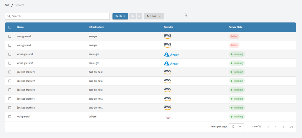
The default Vuetify Data Table doesn’t support per-column filtering out of the box, so I needed to get creative, even if you can override the default filtering used with the search prop.
The Approach
Attach filter UI elements to each column headerBind filters to a filters object keyed by column titleApply the filters to the data using a computed propertyChange the icon and icon color on the header to indicate active filters
I. Injecting the Filter UI into Headers
In the v-slot:[header.key], I added a v-menu that displays a filter operator dropdown and a text input:
<template
  v-for="header in dataHeaders"
  v-slot:[header.${header.key}]="{ column }"
  :key="header.key"
>
  {{ column.title }}
  <v-menu :close-on-content-click="false">
    <template v-slot:activator="{ props }">
      <v-btn icon v-bind="props" color="transparent">
        <v-icon v-if="filters[column.title].value">mdi-filter</v-icon>
        <v-icon v-else>mdi-filter-outline</v-icon>
      </v-btn>
    </template>
    <div class="filter-menu">
      <v-select
        v-model="filters[column.title].operator"
        :items="['=', '!=']"
        label="Operator"
        variant="outlined"
        density="compact"
      ></v-select>
      <v-text-field
        v-model="filters[column.title].value"
        label="Search Term"
        variant="outlined"
        clearable
        density="compact"
      ></v-text-field>
    </div>
  </v-menu>
</template>
Each filter’s state is stored in a reactive object:
const filters = ref<Record<string, { value: string; operator: string }>>({});
II. Initializing Filters for Each Column
Once I loaded the table headers, I made sure to initialize the corresponding filters:
dataHeaders.value.forEach((header) => {
    if (!filters.value[header.title]) {
        filters.value[header.title] = { value: "", operator: "=" };
     }
});
This ensured every column could be filtered independently and to avoid errors related to empty/null data.
III. Applying the Filters to the Data
I used a computed property to transform the data on the fly:
const filteredData = computed(() => {
  return recordData.value.filter((item) => {
    return Object.entries(filters.value).every(([filterKey, filter]) => {
      if (!filter.value) return true;

      const matchingKey = Object.keys(item).find((key) => {
        const normalizedFilterKey = filterKey.toLowerCase();
        return key.toLowerCase() === normalizedFilterKey ||
               key.toLowerCase().endsWith("name") &&
               key.toLowerCase().startsWith(normalizedFilterKey);
      });

      if (!matchingKey) return true;

      const itemValue = String(item[matchingKey] || "").toLowerCase();
      const filterValue = filter.value.toLowerCase();

      return filter.operator === "="
        ? itemValue.includes(filterValue)
        : !itemValue.includes(filterValue);
    });
  });
});
This filtering happens client-side after the data is fetched.
IV. Adding UX Details
A few extra things I did for better UX:
- Colored icons: A regular filter icon shows when a filter is active.
- Clear filters button (optional): Could be added for each column.
- Auto-focus: Focuses on the text field when the menu opens.
<v-data-table-server
    v-model:items-per-page="itemsPerPage"
    :items-per-page-options="itemsPerPageOptions"
    :max-height="'50vh'"
    fixed-header
    v-model="selected"
    class="rounded-lg"
    :headers="dataHeaders"
    :items-length="recordLength"
    :items="filteredData"
    :loading="data.loading"
    :search="search"
    :select-strategy="'all'"
    @update:options="loadRecord"
    @click:row="onRowClick"
    show-select
  >
    <template
      v-for="dataKey in dataHeaders"
      v-slot:[`item.${dataKey.key}`]="{ item }"
    >
      <slot
        v-if="item"
        :name="dataKey.key"
        :value="item[dataKey.key]"
        :record="item"
        >{{ item[dataKey.key] }}</slot
      >
      <span :key="`${dataKey.key}-placeholder`" v-else>-</span>
    </template>

    <template
      v-for="header in dataHeaders"
      v-slot:[`header.${header.key}`]="{ column }"
      :key="header.key"
    >
      {{ column.title }}
      <v-menu :close-on-content-click="false">
        <template v-slot:activator="{ props }">
          {{ filters[header] }}
          <v-btn
            icon
            v-bind="props"
            color="rgba(255, 0, 0, 0.0)"
            style="box-shadow: none"
          >
            <v-icon v-if="filters[column!.title!].value == '' ||filters[column!.title!].value == null" color="white" size="small">mdi-filter-outline</v-icon>
            <v-icon v-else color="orange" size="small">mdi-filter</v-icon>
          </v-btn>
        </template>
        <div style="background-color: white; width: 200px; border-radius: 10px;">
          <v-select
            v-model="filters[column.title!].operator"
            :items="['=', '!=']"
            label="Select operator"
            class="pt-4 pl-4 pr-4"
            variant="outlined"
            density="compact"
          ></v-select>
          <v-text-field
            v-model="filters[column.title!].value"
            class="pl-4 pr-4"
            type="text"
            label="Enter the search term"
            :autofocus="true"
            variant="outlined"
            clearable
            density="compact"
          ></v-text-field>
        </div>
      </v-menu>
    </template>
  </v-data-table-server>
What’s Next?
After adding this new feature, the sort indicator next to each column header disappeared—although sorting still works as expected. I haven’t had time to look into it yet, but I’d like to find a solution. If you happen to figure it out, feel free to share it in the comments!
Where to find the complete code ?
You can check out the complete and latest code in the open-source project on GitLab:
👉 https://gitlab.com/yak4all/yak_frontend/yak_ui
The relevant logic lives in the YakGrid.vue component.
Conclusion
By embedding filter controls directly into column headers and managing state reactively, I was able to turn a basic Vuetify data table into a much more powerful data exploration tool.
Let me know if you try this pattern or come up with improvements—I’m always up for iterating! You can also suggest changes or contribute directly on the GitLab repo of the Yak project.
![Thumbnail [60x60]](https://www.dbi-services.com/blog/wp-content/uploads/2022/08/FRJ_web-min-scaled.jpg)
![Thumbnail [90x90]](https://www.dbi-services.com/blog/wp-content/uploads/2022/08/GRE_web-min-scaled.jpg)
![Thumbnail [90x90]](https://www.dbi-services.com/blog/wp-content/uploads/2022/08/DWI_web-min-scaled.jpg)
![Thumbnail [90x90]](https://www.dbi-services.com/blog/wp-content/uploads/2022/08/HER_web-min-scaled.jpg)